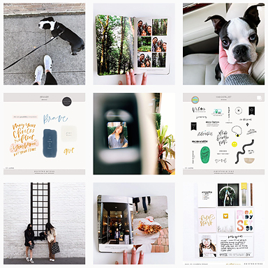
 Hey there, Catherine here! I get a lot of questions about the resources I use when putting together pocket page layouts, so I thought it would be helpful to compile an updated list of my favorite tools for hybrid scrapbooking.
I stumbled upon pocket page “scrapbooking” (for lack of a better term) when I was researching ways to document our first son’s first year.
I hadn’t done much prior to that with my photos – from college, meeting and dating my husband, and our first 7+ years together pretty much remain undocumented.
But when we were pregnant with our first, I knew we’d take countless photos, and I wanted to do something with them.
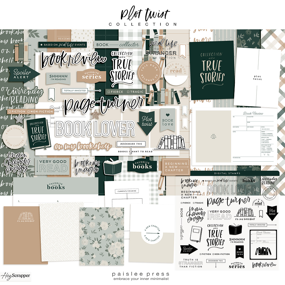
As I was researching options for what to do with our photos, I came across Project Life and very shortly thereafter I found Paislee Press. Liz’s style so resonated with me. I had been designing custom wedding stationery for a few years at that point, and her minimal style convinced me that I could make memory keeping my own.

It’s funny how some of my preferences have changed over the years, while some have really remained the same. That tiny baby is now in six years old, and I’m so happy to have found this creative outlet that also has great meaning for my family and me.
If you’re new to pocket pages or hybrid scrapbooking or just curious about some of my favorite tools and products, read on for details and links!
Photo Editing
Faves: Photoshop + A Color Story
For photo editing I use A Color Story app. My favorite tools are brighten, sharpen, and cooling down the temperature on my color.
Photoshop Elements is great for simple photo editing and using digital templates like the ones Liz designs.


I print my photos locally or with Persnickety Prints. I never cracked the code on printing at home!
Speaking of…
Templates
Faves: Autumn Vibes, Scenic Route Photo Templates, 4×6 photo templates vol. 1, vol. 3, Minimalist 4×6 templates.
I’m a huge fan of all of Liz’s photo templates, but here’s what I look for when I’m choosing which ones to use in a layout.
I like some white space – borders, blocks of negative space with space for a caption or title, graphic text or elements.


I also tend to use a mix of full-bleed photos alongside templates. I think it keeps the layout interesting and not too cluttered.
Pattern
Faves: Woodgrain, more or less (papers), the magic hour (papers)
I love using pattern on individual cards to break up photos and journaling. I even use patterned 12x12s to add sections to photo books.
Sometimes I look for patterns that complement the colors in my photos, or I’ll pick a neutral color palette and pop it into the layout.
Either way, Liz’s patterned pages can add so much to a simple layout or project.
Fonts
For journaling, I’ll sometimes use the font Liz has chosen for one of her kits, or I’ll pick a go-to favorite of mine like Aleo, Nevis, or Brandon Grotesque.
I usually print a bit of journaling on plain white 3×4 cards or I’ll add a caption to a template.

Pocket Pages
Faves: Design A pocket pages + inserts
I use Design A pocket pages from Becky Higgins.
I also like using letter-sized inserts for larger photos or to include more journaling in a layout.
The Album
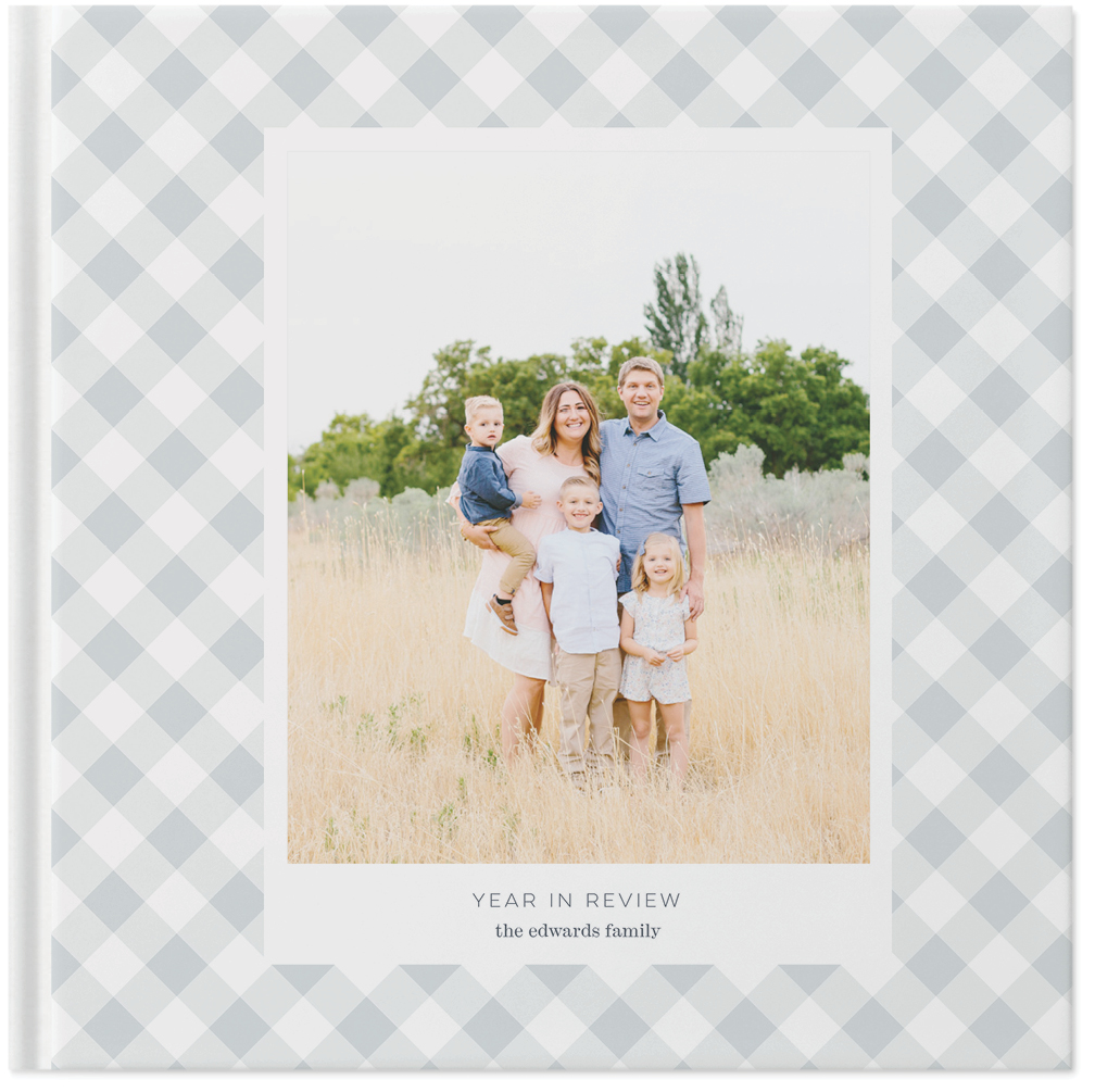
Fave: Grey 12×12 cloth album
When it comes to our family albums – the kids’ baby books, our Europe book (one album for two years), and the kids’ school years – I gravitate to simple 12×12 inch fabric albums.
I’ve kept ours simple and uniform because that’s just kind of how I roll, but I’ve found it’s important to pick a high quality binder that will last for years while little hands flip pages and pull them off shelves.
With so many amazing creative options out there I find I get overwhelmed, so keeping things simple really helps me.
What about you? What are your favorite tools and resources for putting together your memory-keeping projects?
You can see more of what I’m up to on my blog or say hello on Instagram!
xo, Catherine


Love all of Cat’s posts… so good!
I would like to know how to ensure that the “white space” prints come out with even borders as shown in these pics. I find mine sometimes get cut off on one side or are uneven when they return from the printing company. Do you upload in a larger size or fuss with the crop tools in the software to get it right? This is really my current production holdup as I don’t want to print at home but can’t rely on the outcome.
Such a good question! I had to play around with the printer I went through. I also do not print at home, so I was sending my photos out to print. I found that Persnickety Prints had reliably bright whites and even printing on the borders, and I got lucky in Germany with an instant printer that worked incredibly well. I found that when I printed through big box stores in the States, my borders weren’t reliably even. I’d go for a pro printer online, like Persnickety or even Shutterfly. xo, Catherine
I love all of the Paislee Press templates and journal cards! And I love how you’ve incorporated them into your layouts! Just beautiful!
Thank you so much, Margot! I’m so glad you like the layouts 🙂 xo, Catherine