
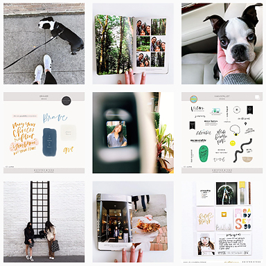
When we moved to Europe earlier this year, I wasn’t sure how I’d document our travels. I started working on about one pocket page layout each month, and now I’ve really hit my groove. Occasionally we’ll have a trip or a month with tons of great photos and experiences I want to include. In this post I’m sharing one of these photo-heavy layouts and how I put it together.
Here’s the layout, without the insert (more on that later):

We spent five days in northern Italy over Labor Day weekend, and I wanted to tell the story of that trip in one layout. I decided to split the pages between the two cities we visited. First up: Milan.

It’s brutally hard for me to select the photos for these layouts, but I try to pick the ones that remind me most of that particular place and time. For example, I included the photo of our oldest in front of the Louis Vuitton window because he’s obsessed with space this year and wanted to have his picture taken.
When I have to be selective about which photos to choose, I pick the ones that make me smile, take me back to the moment, and remind me of the experience.

I used a little word art and a pre-printed journal card to add some minimal text with a cheeky “we are here / we were here” message. In a photo-heavy layout like this, I use lots of white in the journaling cards to give the photos room to breathe.

On the right side I documented our time in Verona.

Again, I kept the photo editing simple and used lots of full-bleed shots – no fancy templates or borders necessary. The light was amazing – I didn’t have to edit many of these photos.

The only journaling I included was the name of the city and the dates we were there on the “title” photo and this plain journaling card with a list of some of the things we enjoyed. The little hand-drawn geotag is from pictures + words no. 14.

I still had lots of photos I wanted to include, so I added an 8.5 x 11 inch insert. On the front, I used photocentric no. 3 to create a 6×8 inch collage of extra photos.


I printed the title at the bottom of a piece of white cardstock and adhered the 6×8 photo printout right on the paper.

It couldn’t have been easier to put together, and I love how it looks. On the flip side of the insert, I wanted to include some notes about our boys and how they’ve been doing with all of the travel (spoiler alert: they’re amazing).

I used a woodgrain card from my core kit, cut down a black and white photo of the boys on a train, added a little word art, and just journaled a bit. I printed the text on the back side of that piece of cardstock and adhered the card and photo before slipping them in the pocket.

Here are the pocket pages together with the insert:


I’m in love with how this layout turned out, and watching our boys flip through this album reminds me how important it is to tell our stories in some form – ANY form! – that works for us.
For now, this is working.
What’s working for you? What are you doing with your photos these days?
I’ll be sharing the step-by-step tutorial for how I put together this insert, so be sure to sign up for my newsletter to stay in the loop (and get some instant freebies!). You can also follow me on Pinterest or Instagram to see what’s inspiring me these days.
xo, Catherine
Products used: 4×6 templates vol. 1 (they’re free!), photocentric no. 3, word art from pictures + words no. 14, Project Life Everyday Edition core kit (designed by Liz).


I love this! I’ve been thinking about trying out some inserts for a physical album I’m currently working on but was unsure of which size to get – 8.5 x 11 looks perfect!
Hey Diana! I’m so glad you got something out of the post – and thanks for letting me know 🙂 I totally love the 8.5×11 insert (I bought a big pack of them on Amazon – nothing fancy). I just use pieces of cardstock in black, white, or kraft, and attach a photo. Love the simplicity. Tag me on Instagram (@catsaunders) if you post an insert you put together – would love to see.
xoxo
Love these layouts and your insert. I love how the completed pages come together to tell your story perfectly! You have a great eye for design and the variety of product used is just right!
I love how this spread came together! What’s been working for me is doing a PL spread for every week. Here’s the thing; as long as I’m working on it, I remember to take pictures. Well, I got busy, got behind, so now I’m looking at weeks (as I’m catching up) with not very many photos. So that’s clearly NOT working. As far as the photos themselves, it really depends on the mood I’m in whether I do a digital brush before print, or print as-is and then add something or nothing afterwards. I’m grateful that I’m flexible enough to go with the flow!