
Hi there, it’s Catherine, and I’ll admit I occasionally suffer from analysis paralysis when putting together a pocket page layout. Am I the only one? I was a little out of my creative practice since we recently moved overseas, and it took me forever to work through a few simple layouts. I figured I can’t be the only one who deals with this, so I thought I’d share a few of my most common design dilemmas when documenting and let you know how I work through them. I’ll warn you that I’m getting in the design weeds today, so for those of you new to pocket pages, don’t be alarmed! This is all in good fun 🙂
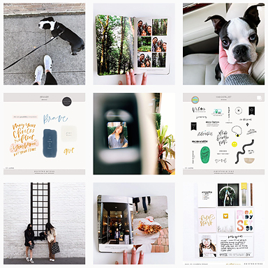
Here’s the layout I’m working through this week.

Dilemma 1: I have so many photos. Which ones should I include?
Everyone tackles this differently, but I try to decide which story (or stories) I want to tell in my layout. Then I select and print the pictures that best capture those stories. Sometimes those aren’t the best photos. The lighting might be crummy, the crop might be off, or one of the kids might be crying. But I try to choose the photos that best tell the story rather than the ones that just look the best. I save those beautiful extra shots for photobooks or frames around our home and I use pocket pages to really tell the story of our family.
The left side of this week’s layout documents life in our hotel suite (our temporary home for almost two months). I included the hallway shot because I watched the kids run down the hall everyday on our way to our room. It’s not the best pic, but it’s iconic in terms of our stay here.

I also included pictures of the kids waiting for the shuttle bus (which we used for three weeks before getting our car) and the kids watching snow fall from the window of our room. They may seem like random shots to someone else, but to me, they bring me right back to this particular moment.

Dilemma 2: Which version of a template should I use?
The beauty of working with digital products is that you have so many options, but lots of options can make decisions more difficult. I don’t print my own pictures, so when I can’t envision exactly how a finished layout will look, I sometimes have a tough time deciding which version of a template to use. In those cases, when I’m really stuck, I just print both versions and use the discarded one elsewhere. If it’s a photo of the kids, I mail it to my mom, who loves getting a new picture for her office.
For this layout, I couldn’t decide which month template to use: the one with white space or the full photo. So, at the cost of a few cents, I printed both.

Once I put the layout together, I could experiment with them and use the one I liked best.

Dilemma 3: How do I simplify a busy layout?
This is my favorite dilemma, because the solution is tried and true, and it works every time: less is more. I’ll give you an example. On the left side, I originally had a collage of color and black/white photos in the upper right corner. When I put the layout together, I just felt like it was too busy. The colors were a little off, and the collage was taking up too much real estate from the journaling and the other photos.

So, I moved it to the previous page and swapped it with a simple black and white pic of the kids and me. We’re in the hotel, so it remains true to the story of the layout, and the collage is at home on another page documenting our travel day, which is when all those pictures were taken.

What happened was that I tried to tell too much on one page: our travel to Germany and our time in the hotel. By shifting the collage, the page breathes a little easier and I was able to include plane ticket stubs, the photos from our trip from San Francisco to Germany, and journaling about our travel day all on one page.

Dilemma 4: How do I correct bad lighting in photos?
Sometimes a photo with crummy lighting can be a distraction in a layout. If I feel really strongly that the lighting is just plain bad, I’ll use an app on my phone (I’m loving A Color Story these days) to lighten the photo and then convert it to black and white. Neutrals go with everything, right? Notice on this page how all of the color shots are exterior, where I had natural light, and all of the black and white shots are interior, where the lighting would have been darker or more yellow. It’s a simple fix for a common issue.

Dilemma 5: What am I supposed to write?
Ah, journaling. Some people are great at it, others of us struggle. My favorite way to incorporate journaling is through photo templates (my go-to templates are from Liz’s minimalist series).

If I want to include more journaling and really tell more of the story in words, I stick to one extended bit of journaling per page. Sometimes I write in full sentences, and sometimes I use more of a bulleted approach. Either way, it’s your album. Capture what matters and don’t sweat the grammar.

I usually pepper the rest of my layouts with little words and phrases, either typed or using digital templates.

Let’s be real: struggling with pocket page design decisions is not a major life crisis. But watching your creative projects collect dust while you sit and ponder the absolutely perfect way to complete them isn’t particularly helpful. I hope you’ve found some of these ideas useful or, at the very least, a mark of solidarity!
xo, Catherine
—
You can see more of my layouts here, or find me on Instagram, Pinterest or (at long last!) over on my blog.
Products used: 2016 title cards, pictures + words no. 14, road trip papers and 4×6 templates vol. 1 (they’re free!), vol. 4 (vertical 4x6s), and vol. 5.


I absolutely suffer from analysis paralysis and as a result, I haven’t scrapbooked in a very very long time. It seems to be worse with age LOL. Thank you for this inspiring article. I hope to get back on my feet again soon.
You’re welcome, Cindy! I know the feeling and I promise it feels so good to just dive in and get started again (if that’s what you want to do!). Good luck 🙂
I made my first page after reading this! Just jumped in. So thank you!
[…] For your design dilemmas. […]
Absolutely stunning pages and such great advice! Your style is impeccable.
Hi Catherine! LOVED this article – your simplistic designs totally speak to me. I was just wondering what are all the apps you use to create your layouts? I’d like to be able to design the cards/photos that I will slip into each pocket, but I’m torn as to what apps to download or purchase. Any help would be greatly appreciated!