After months and months of talking about doing a site overhaul, and then months and months of actually working on the design, I’m super excited to finally reveal the new site! First things first. This redesign would not have been possible without professional help and I am forever grateful to Kara Haupt, designer extraordinaire, for making this possible. She is a dream to work with – super knowledgeable, very organized yet totally easy going, extremely prompt with responses and so patient with me and all of my requests: “I like white space but can you close the gap between the image and that line just a wee bit?” “I know I said I don’t like drop shadows but can you apply it to the dropdown window?” Yeah….I was that client.
So what’s new? Pretty much everything! The biggest change is probably that the site is now fully responsive and should look good on all mobile devices. I (snifffle sniffle) dropped the camera logo from the site banner. It was high time for a change but I wasn’t quite ready to let go of the camera icon altogether so it now appears as a favicon. Is that the best move from a branding perspective? Maybe not. Is it helping me deal with changes? Totally.
What else? We now have a landing page. Also, the blog format is cleaner, even more simple that it used to be. No more sidebars! Hopefully this creates a more enjoyable, distraction-free reading experience. I didn’t get rid of widgets altogether though. You can find them now at the footer of the blog.
I finally updated my about me page.
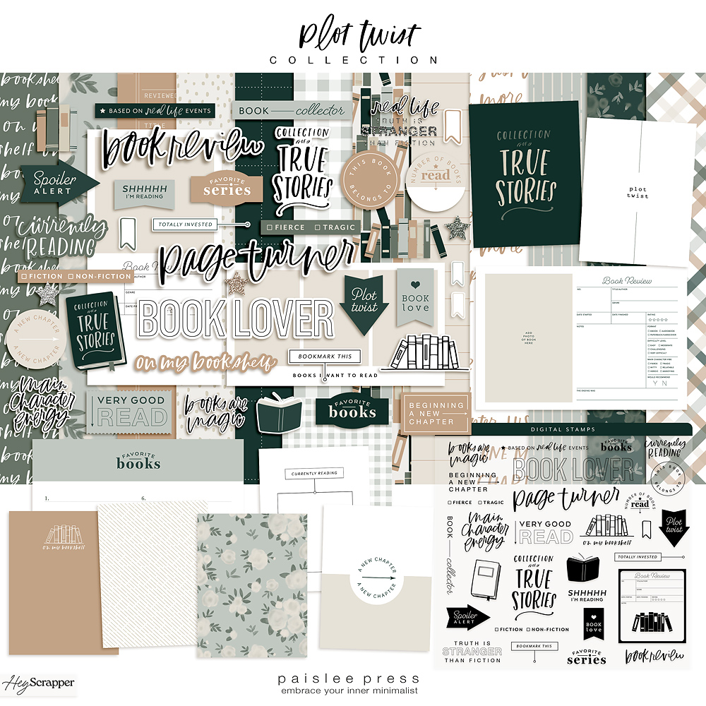
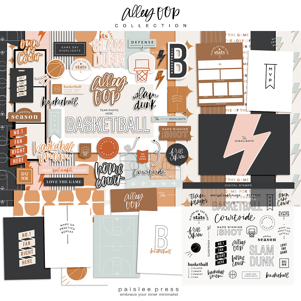
This page now includes a “Where to Find My Products” section, which sort of excites the inner organizational geek in me. It took me a while to figure out how best to set up this section in a way that (1) gives a quick overview of my designs, (2) include images that are clickable if you want to learn more about that collection and (3) is a format that I can easily update with new work. Now you can quickly scroll through and browse by products and/or by brands I’ve worked with over the years. I’m pretty happy with the way it turned out but more work needs to be done in this section.
The creative team page finally includes links! Yay!
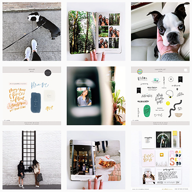
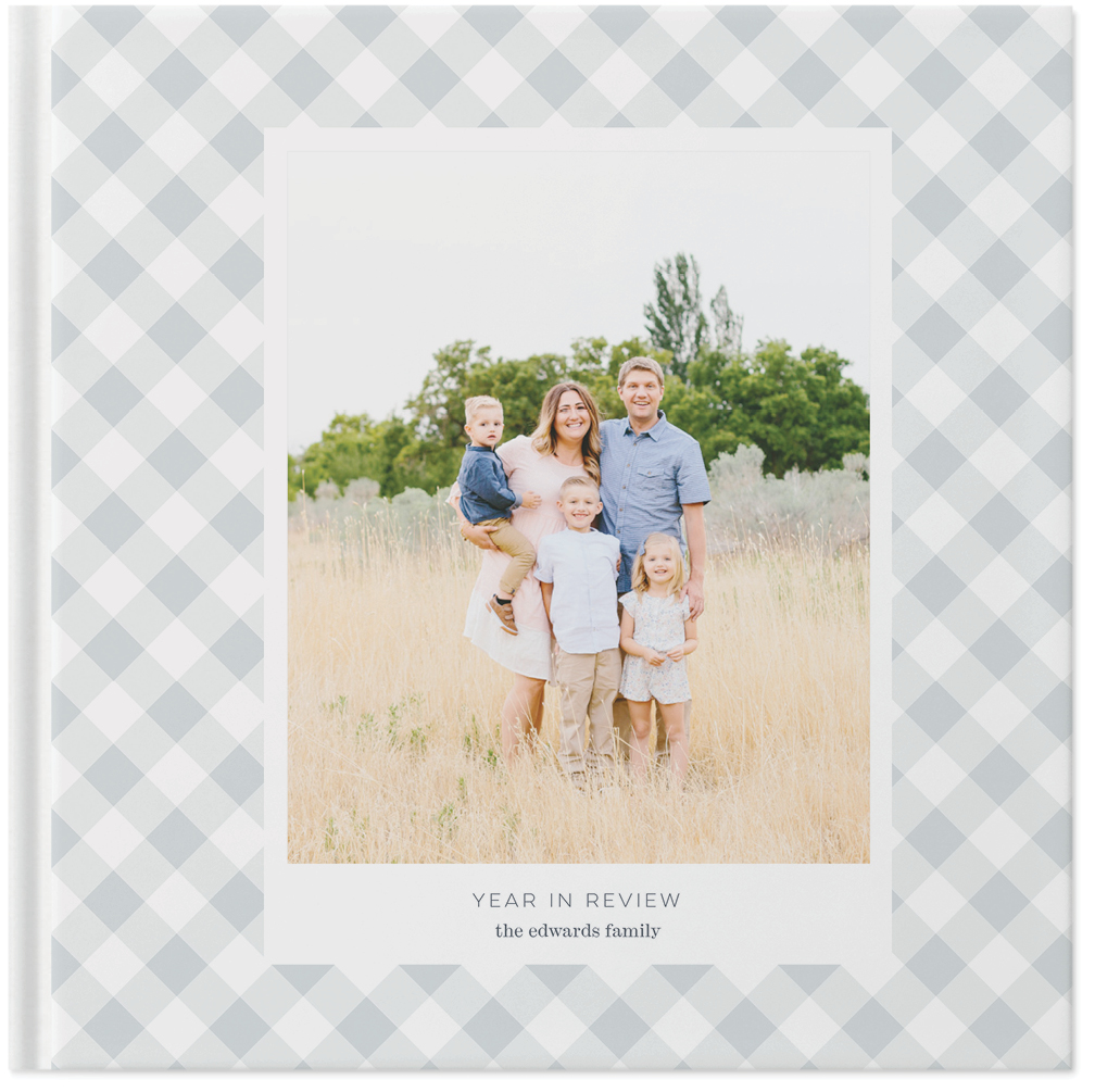
And finally, the one that I’m most excited about is the new PROJECTS page. It’s set up now so you can browse by project type (photobooks, pocket scrapbooking, mini albums, etc.) and by project maker (projects by me, projects by the creative team and projects by customers we’ve featured). I’d like to take it one step further and create separate categories so you can search by blog contributors as well. So this page is still a work in progress.
There are a few kinks that need to be worked out and fixed but all in all we’re almost there. If you see anything wonky, please let me know and as always, thanks so much for visiting.


It looks so good!!!!! Clean and simple. I love it!
Yay, the new look get’s Carly’s stamp of approval!! So thrilled you like it!
It looks so cool on M Samsung Galaxy S3. I love it!
Awesome, glad to hear that Rae and thank you for the feedback, it’s much appreciated!
I love it Liz! So beautiful, clean and all simple:)
Yay, thank you Michelle!!
Congratulations Liz! I love the clean look!
I’m viewing this on Chrome, and the menu bar doesn’t appear for me like it does in your screenshot. The “Blog” button wraps under the “About” button and sits on top of images/text when I scroll. Not being nitpicky on purpose, I just noticed.
I can’t wait to explore your projects!
Hi Nat! Thank you so much for pointing that out. I’ve been staring at the site for so long, I’m missing little things here and there so I appreciate you letting us know!
The new look is pretty, Liz! I love everything! It reflects you 🙂
awesome new look! I already LOVED your blog before, and now it’s even better! YAY! 🙂 sending you love! 🙂
This new look is great, and yeah, I miss that little camera too. 🙂
Liz, it looks awesome on my iPhone 🙂
Tara
love it! Awesome work, I know it’s hours and jots of adjustments and visualization. You’re my fave project life designer, so fun to have a fresh site to explore and gather inspiration.