
Happy 2014 ! It’s Caylee and I’m sharing my first layout for the year.
So I have this thing where I feel like writing on the first double pages of a notebook is too much pressure. Like these first two pages should be the very best two pages of the notebook. They are definitely too good for me to just get into the notebook. And so I leave them blank. In every single journal, book of lists, study book, and Moleskine that I own, the first double page is left blank. And I realised I’ve done the same with my Project Life files. I know that there is a cover page, but it feels like putting the first week for the first double spread is not “worth” the honour of this spread. Unlike my notebooks, I couldn’t leave it blank, and Week Zero seems to be my happy compromise. It’s weird, I know.
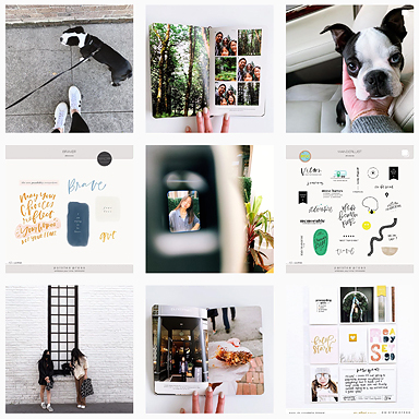
Last year I had the perfect content to fill my Week Zero, but this year I combined my strange inability to go directly into Week One with my love for PL title pages. I adore Elise Blaha and Trisha Harrison‘s triangled cover pages, and when the new paislee press kit had a geometric paper I knew I had to use it as a collage.
This is how I did it (click on the image to make it larger):

1. I opened up the paper in Photoshop, saved it as another name so that I don’t overwrite the paper file. Then, I made each section into a layer to make it easier to clip. I did this by selecting a section with the Magic Wand Tool, right clicking and choosing Layer via Copy.

2. I chose another paper from the set, dragged it into the document, and put it above the layer that I wanted it to fit over. I then clipped it over the section by right clicking on the layer and choosing Create Clipping Mask.

And it fit beautifully into the sort-of-triangle.

3. I continued clipping for each section/layer, and playing around with positioning, until I reached a collage that I was happy with. And this is what I ended up with:

I printed it out, and I liked it so much that I made a mirror of the image for the other side. A less lazy person would have put new images in the mirror image.

Products used: Brightside papers, elements, and journal cards.
I hope you can find a use for this tutorial. It is always fun using papers elements for more than what they are, and stepping out of the Project Life pocket “limitations”.
♥ Caylee
You can find more bits of my life on Instagram, Twitter, Pinterest, and my blog.


Awesome! It looks fantastic!
I love this idea, and I think the design is even better with the same images flipped.
Ah thanks. I still can’t decide if I like it, but I’m too lazy to try something else.
these. are. amazing. you are a constant inspiration!
As are you, darling ♥
Very cute! I do that too in my notebooks…I feel like there needs to be something more important on that page, but rarely go back to add anything.
This is such a great idea!
oh my… love this
Now I just want to go home and give it a try!
Thanks for the inspiration, Caylee
Gorgeous!!
How do you combat the problem with cutting the 3x4s to match the 4x6s? I was inspired to do a big photo cut up to go in the page protector after reading your blog but I found i had to chop a bit extra off the 3×4 row and then the lines didn’t match up quote right on the page. Anyway, love your work!!
You know what ? South African photos print at just smaller than 4×6″, so if you look closely you’ll see that my prints don’t fit quite perfectly. Where this does help is when I cut the photo in half, the resulting size fits tightly into the 3×4″ (since it’s just smaller than that). I’m strangely not a perfectionist with this, and don’t really worry about it. Some of my big pictures are not lined up, and I’m okay with it. I just did a check that these were lined up, and I can’t believe that they were. But you’ll see that each print did not print the exact same blue. And I’m okay with it.
I guess the easiest way to fix it is to either print detailed things that you’d notice if they’re off in the middle of where the pockets would be, or chop off the outside of the 3×4″s instead of the middle, where you’re more likely to notice the difference. Or you could be completely elaborate and put a line in the middle of your 6×4″s before printing that is equal to the size of the pocket line between them.
What a lovely layout!! So creative – this would make a gorgeous collage to hang on the wall, too. 🙂 Caylee – I can’t wait to see what you do this year with PL! Your work is always inspiring. xo
Hey you’re right ! My first experience with formal memory keeping was with Project Life so I didn’t even think of this picture except in terms of 4×6 and 3×4 pockets. I am totally going to be printing this up and hanging it on the wall. Thanks for the inspiration, lovely.
Amazing ! Love it!
I just love this. So well designed. Your directions are great too! I am just learning photoshop (and scrap booking for that matter) and I have probably a silly question… How do you print a 12 x 12? Or do you break it down in PS and print it in pieces? It seems like it should be obvs, but I’m not sure;)
I print my 12×12 as six 6×4 prints. I do it slightly differently to most tutorials I’ve seen because I use clipping masks. I will be sharing it on my blog soon. For now, Elise Blaha’s has a great process and shares it with a video tutorial:
I love big pictures, they really make a week easy.
I have a similar weird thing, I don’t like to write on the first line of a page. Unless I can put some sort of title on that line, it stays blank 🙂
Anyway, I love this! You’re so freaking creative, and I have the feeling I’m going to learn a lot of PS tricks from you… 😉
Glad to hear I’m not the only weirdo 🙂 Thanks for your comment.
[…] I’ll be sharing my Project Life cover page next Tuesday, but my Week Zero (and a bit of a tutorial) is on the paislee press blog. […]