 Hey there, Catherine here. Over the years, I’ve honed in on a simple style for my pocket page layouts using photos, journaling, and digital design elements. In this post I’m sharing a quick list of what I do when creating simple, minimal pocket page layouts.
The photos you’ll see are from a layout I created documenting a long weekend we spent in Copenhagen and Berlin.
Here’s the full layout:

Supplies used:
- Winter Vibes templates from Paislee Press
- 4×6 photo templates vol. 1 (free download!)
- Design A pocket pages from Becky Higgins
There are a few design elements that seem to be present in almost every hybrid layout I create.
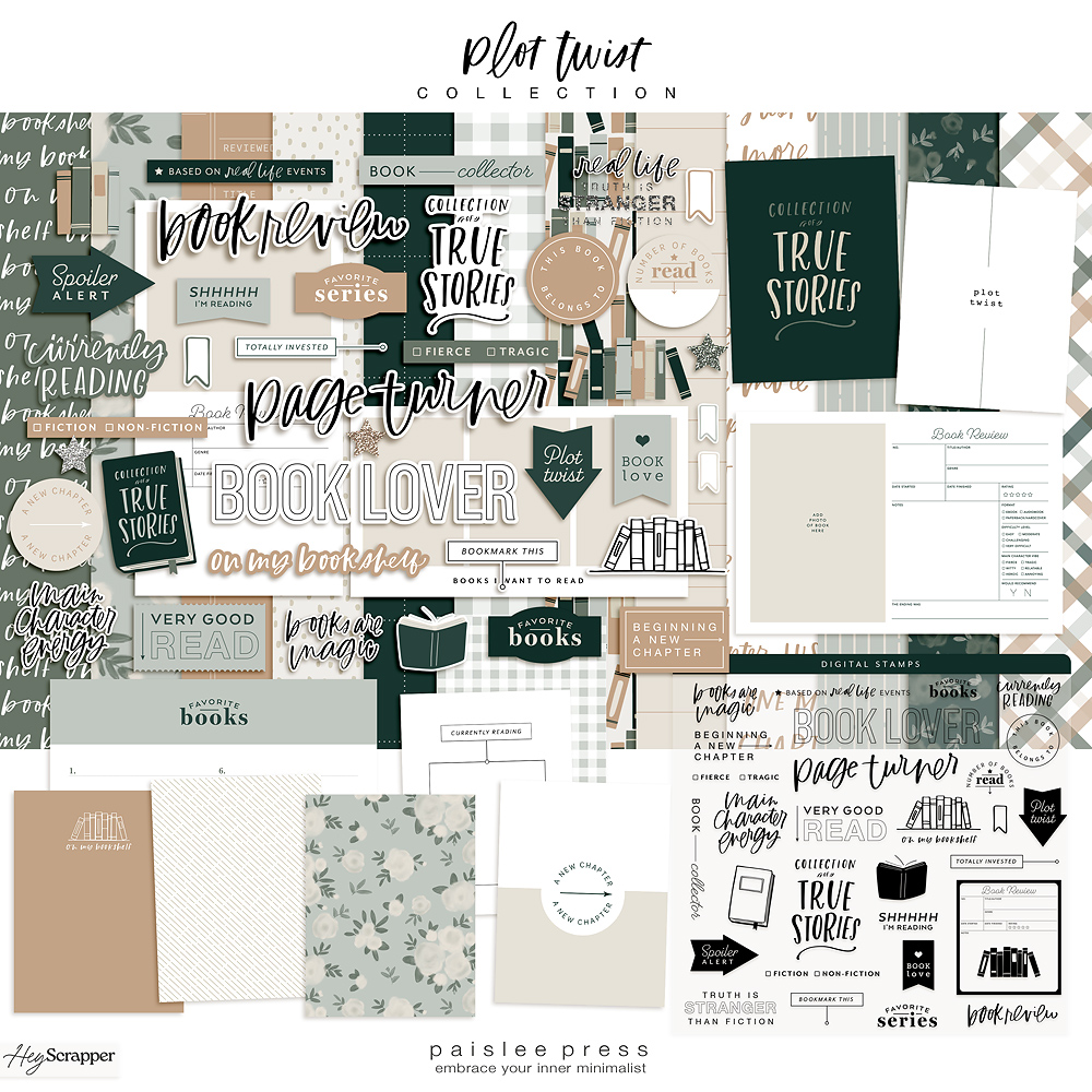
One | Digital elements from one kit (or multiple complimentary kits)
In this case, I picked one digital kit from Liz’s shop and used templates from that kit alone. I think selecting elements and templates from one kit keeps both the decision process and the design outcome simple!
Choose something that goes with your photos or story. In this case, I went with the winter vibes templates, which perfectly accompanied my photos.

Two | Unify photo colors
When I’m selecting which photos to include, I try to pick the ones that best tell the story of that day or event, but I like the look of layouts that have a unified color story.
On the left page in this layout, most of the photos come from one day. We were walking around Copenhagen checking out Christmas markets and happened to be wearing colors that really worked with it all. I converted just one photo to black and white since that’s the photo that had clashing (and kind of crummy) lighting.

In the layout on the right side, I picked up on the blues, greens, and grays in Berlin and in the kids’ clothes. For clashing lighting, once again I converted photos to black and white.
I like how simple layouts become when the colors work well together among the photos.

Three | Include white space
If you know anything about me, you saw this one coming!
I love including lots of photos in a layout, but I try to balance all of that color and busy-ness with a dose of white space.
In this layout, I did that with simple title cards listing just the name of the city we visited on a white background.
 I also incorporated white space just by using Liz’s photo templates, which usually contain lots of white to balance the photos.
This isn’t about minimalism for me. This is about helping the photos really jump off the page. It means including fewer photos, but that also means including the photos that really help tell the story most effectively.

Four | Mix collages and borders with full bleed photos
In every layout I design, you’ll find a mix of templates with white borders, photo collages where there are lots of photos in one space, and full bleed photos, which just means the photos stretch all the way to the edge of a pocket.
Again, mixing up the way you display your photos helps keep the eye moving around the page.
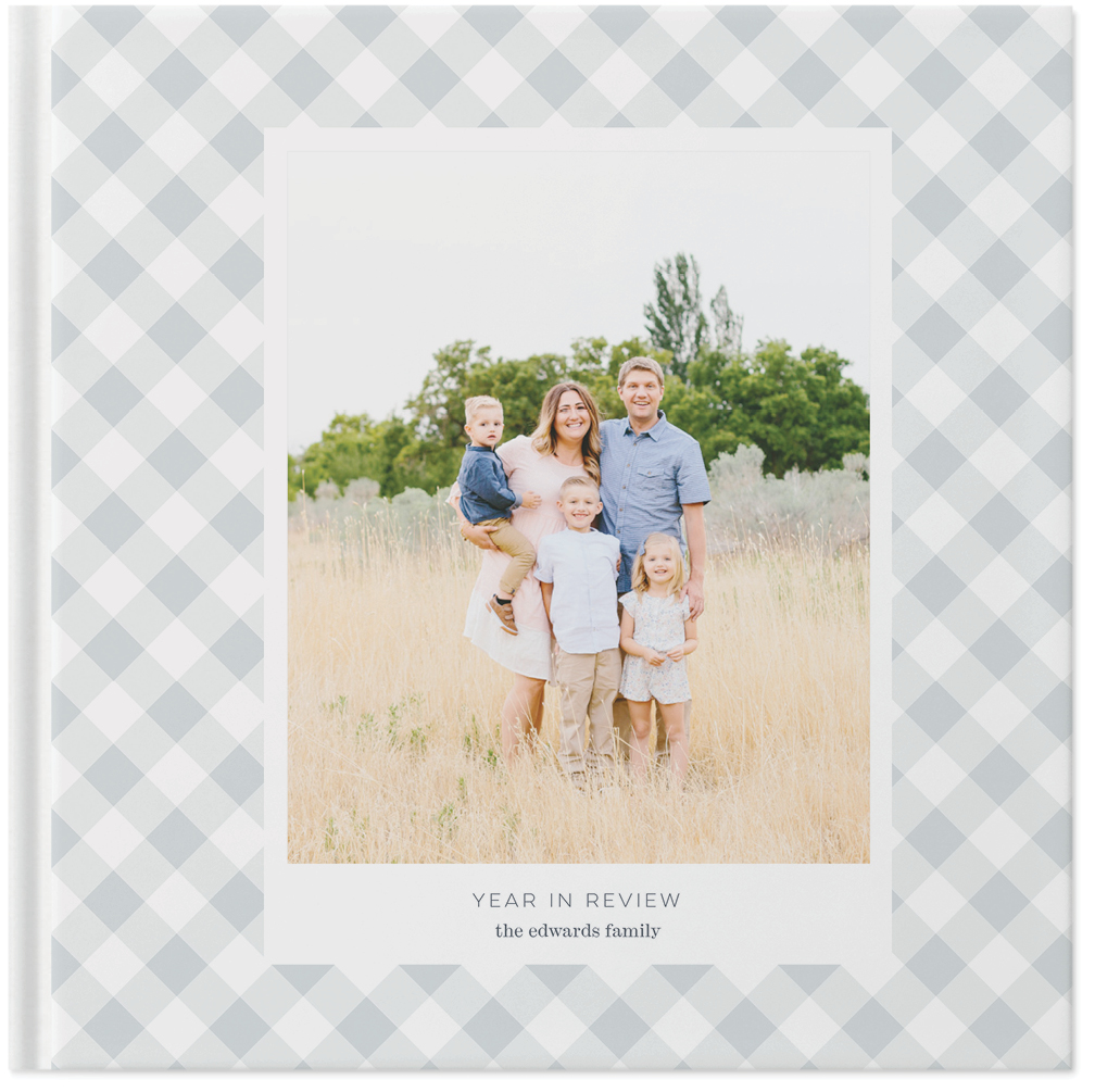
The same is true if you’re putting together a photo book. Have a page with one massive photo right before or after a page with lots of little photos. That’ll keep you flipping without overwhelming your eyes with too many little photos.


Five | Choose elements that tell the story
Most importantly, choose simple elements that tell the story.
I don’t tend to include patterns for the sake of patterns or tons of photos just because I have them.
I really try to hone in on why I’m putting together a layout – what memories mattered that day or week or month? Which photos tell the story? Which design elements best enhance that story?
For me, less is more. It’s not about including as much as possible, but including as much as is needed to jog and memory and convey the meaning behind a moment.
In this layout, I used the winter vibes kit, which perfectly corresponds to the photos from that long weekend in northern Europe.
Just a few photos, a few bits of journaling and titles, and a few little design elements are enough to help us remember what was such a fun and meaningful long weekend.


So here’s my checklist:
- Use simple digital elements
- Unify photo colors and use black and white to correct poor / clashing lighting
- Include white space
- Mix photo collages, borders around photos, and full bleed photos
- Choose elements that tell the story
I really believe our memories matter enough to document them. And I’ve found that the simpler I keep the process, the more likely I am to keep up with it.
To see more of what I’m up to, check out my blog, say hi on Instagram, or follow along on Pinterest.
xo, Catherine
What are your favorite elements to include in your memory keeping?


I always, always LOVE whatever you do with photos and text, and have been admiring your work for several years. May I ask what font you have used to type out the titles “Copenhagen” and “Berlin” on the otherwise white cards?
Hi Ingrid! I’m so sorry for the delay on the reply, but the font you’re asking about is Nevis 🙂
I LOVE these pages. Love them.
Thanks so much, Candy!
You do such beautiful work. LOVE these pages…..I agree that less is more. What a special time with you. xo