I’ve been thinking a lot recently about why memory-keeping matters. For me, it’s about preserving, in a small way, these really important moments in our lives.
The last year and a half has been an interesting time for our family. We’re living in Europe, far from our extended family in California, and we’ve tried to take advantage of the time here by exploring this amazing continent.
And while seeing places like Malta, Croatia, and Hungary has been incredible, it’s really the time together as a family of four – on airplanes and trains, waiting in long lines, eating dinner in AirBNBs, exploring new places – that’s been the most memorable.
So I’ve stuck to documenting each of our trips using pocket pages, and I’m noticing that my approach continues to be minimal. For me, it’s about capturing that moment with a few photos that tell the story, a few words that will remind me of our experience, and a few key design elements that tie it all together.
It’s not necessary for me to document every single experience, but to capture the feeling of a moment and have a space to keep track of these memories.
Today I’m sharing how I put together a simple layout documenting a recent trip to Scotland.
Here’s the layout. I used a Design A pocket page from Becky Higgins and an 8.5 x 11 inch page protector for the insert.

Include a Title Pocket
I’ve started including one title photo in each layout, and this was no different. I used Oswald for the “Edinburgh” text, which is available as a free download, and I use Photoshop to add the text, although there are plenty of apps out there that will let you add text to photos. Whether you put text on a photo or use a journaling card and your own handwriting, I love the idea of having a similar title pocket for each layout in an album.

Use Photo Templates
And as usual, I’ve included lots of Liz’s photo templates (the links to the ones I used here are listed at the bottom of this post). Photo templates let me include lots of photos mixed with white space and text. Love them.


Include Journaling
Lately, I’ve been including a plain journaling card with notes or reflections or even our itinerary for a trip. Basically, I just like to include some notes on the layout that help remind me of the memories from that particular set of photos. My go-to font for this has been Aleo for years. Maybe I’ll switch it up someday, but for now it’s still working.

Incorporate Handwriting
In this layout I used both my own handwriting and Liz’s gorgeous lettering, and I always love the look of mixing printed text with handwriting. I think it adds texture and makes the layout feel more personal.


Add Simple Design Elements
Whether it’s a little bit of pattern (like in the journaling card I printed Liz’s lettering on) or a digital stamp (like the one I used from Scenic Route), a few simple design elements go a long way to adding interest to a layout. Using different design elements helps differentiate layouts and breaks up photos and text.
I usually use a couple of elements from one of Liz’s kit per layout. They tend to coordinate within the kits, which keeps things simple. I also usually keep design elements in black and white, which helps the album feel cohesive even when I’m using various kits throughout an album.


Include a Simple Insert
I’ve gotten back to using inserts, which I used to do more frequently. For this insert, I printed the little “adventures on the road” design element on a piece of kraft card stock, taped a 6×8 insert to it using washi, and added a bit of handwriting as a caption. Really, really simple, and I like the block of kraft paper to break up the photos.
Inserts can be filled with text or photos or include one large photo, but they’re a nice way to include a bit more to a layout if you don’t want to do a full layout.


Feature a Favorite Group Photo
Lastly, I always make sure to include a family photo. We take tons of pictures of the kids, and it isn’t always easy asking someone to take a picture of the four of us, but I’m always glad to have at least one in a layout.


Whatever your method of memory-keeping, what motivates you to keep documenting? Do you find it easy or hard to keep things simple?
It’s been a busy season for me, so I’ve slowed down online, but you can track me down on my blog or over on Instagram or see what’s inspiring me on Pinterest (still a fave for me!).
xo, Catherine
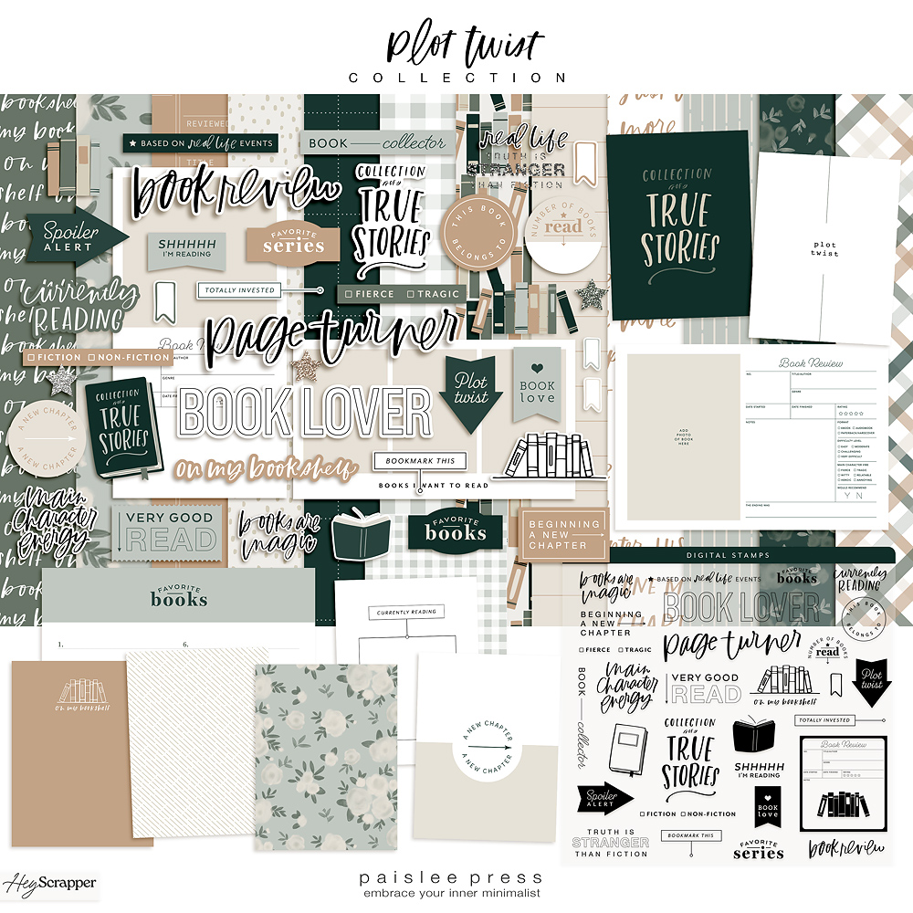
Paislee Press digital products used: Scenic Route Elements, 4×6 Photo Templates Vol. 6, Minimalist 6×8 Collage Templates, 3×4 Photo Templates, 4×6 Photo Templates Vol. 3.


[…] how to design a minimal pocket page layout – 1 freebie(s)? […]
I rorally love your work and your style! We haven’t seen you in a while on IG.. I was even kind of worried.. glad to know you’re alright 🙂
Oups I meant totally not rorally haha.. sorry
Awwww Amanda you’re so sweet! I’ve been completely off of IG recently because of visiting family and just needing to take a break to wrap up the school year and take care of the family. But I’m fine and I’ll be back 🙂 I so appreciate the comment and the compliment. I’m glad this style of memory-keeping resonates with you. xoxo, C