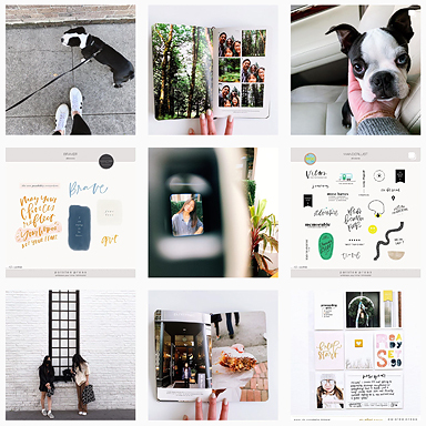
As I’ve worked through my pocket page album for the last two years (yup – two years in one album), I’ve come up with a workflow that’s helping me keep things simple enough that I’m actually keeping up with my memory keeping.
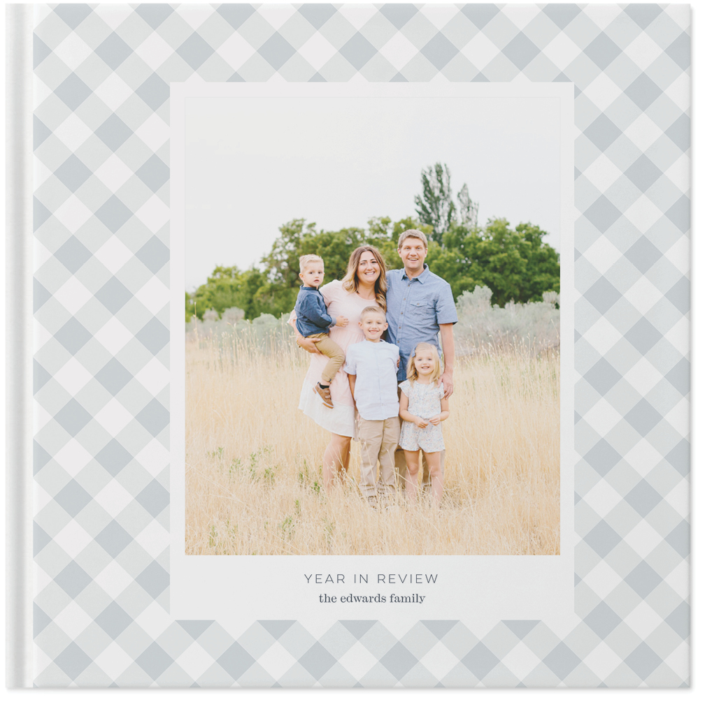
The most significant element of my workflow is that I only create layouts once a month, and I usually only do one layout per month. I create a family photo book at the end of the year that catches the bulk of our photos, but for my pocket page album, I’ve taken a really minimalist approach.
Below are the steps of my workflow that I’ve been applying to a typical layout, like this one documenting a week we recently spent in Croatia.

1 / Select the photos
For this layout, I had hundreds of photos from which to choose. We spent spring break exploring Croatia and Bosnia-Herzegovina over the course of a week, so there were tons of photos on my phone.
I scrolled through everything and moved my favorites to a folder on my phone. From there, I pared down even further until I only had about fifteen photos.
I loved the series of photos of our son Ben leaning against a 1600 year old wall in Split, so I included three of those, which I figured I’d put in a triptych.
Other than that, I just tried to select at least one photo from each of the memorable experiences we had. Obviously, these don’t tell every story from the week, but they tell the most important ones.
This part of the process is so hard for me, but I find if I do it on my phone, I work more quickly than scrolling on my computer.

2 / Edit photos
I edit photos exclusively on my phone these days. There are so many apps to use – many of them free.
I’m actually finishing up a mini-workshop with videos and other resources on how I capture and edit photos on my phone, which will be available soon! It’s free for my email subscribers, so be sure to sign up if you’re interested!


3 / Incorporate templates and word art
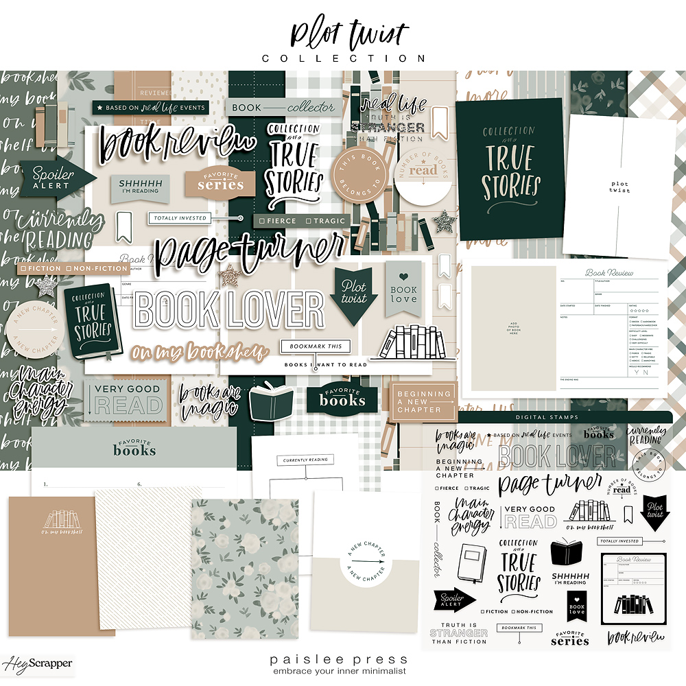
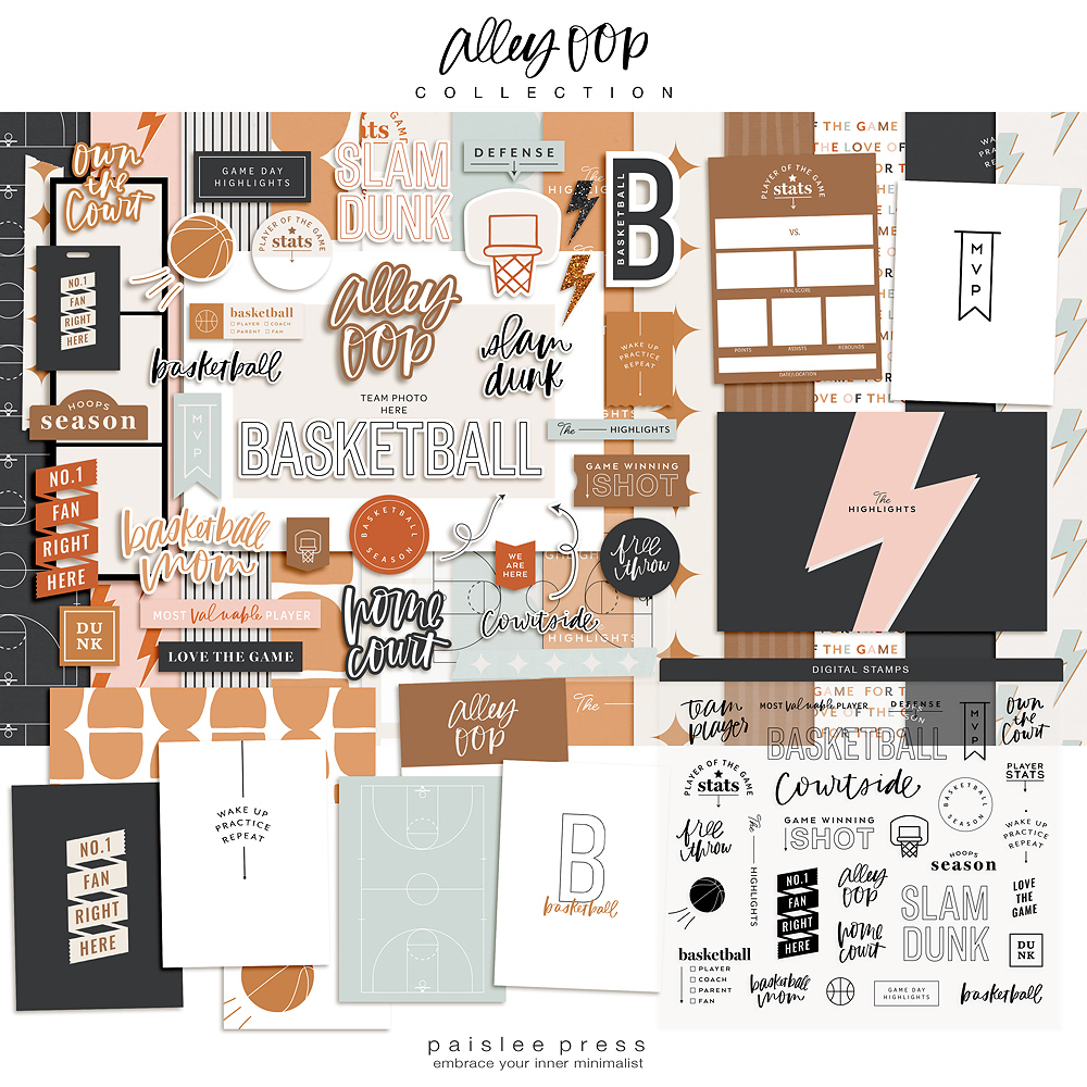
Next, I move the few edited photos to my computer and open them in Photoshop. I’ll then search my stash of Paislee Press templates and word art or check out Liz’s shop to see what’s new.
I love using templates to add white space and word art to add a little texture and dimension to photos. I also try to mix in some dark pattern or color to contrast with the white space.
Occasionally I’ll add a caption or text to a photo as well, which I’ll do in this step.
Lately, I’m loving Liz’s series of pocket page guides. For this layout, I used pocket guide no. 8 with the “adventure” theme. It was perfect for this layout along with word art from a couple of my favorite template kits.

4 / Send JPEGs to print
I get all of the templates and Photoshop edits done at once, save everything as JPEGs, and send them all to print.
In Germany, I’ve been using an instant printer, but in the US I would print at home or send my photos in batches to professional labs like Persnickety Prints or WHCC.


5 / Assemble the layout and add journaling
My favorite part of the process is seeing everything come together! I love getting a batch of photos and sliding them in the pockets, moving them around until they look just right.
Then I add patterned cards from the Project Life Everyday Edition core it and plain white cards for journaling.
For this layout, my journaling is simply our itinerary listed on three plain white 3×4 cards plus a “title” card on a pattern background.
I tend to use the same fonts over and over. For these cards I used Helvetica and Aleo.
If I’m including memorabilia (like in this layout), I’ll add it to patterned or plain white cards in this step.
Creating a pocket page album documenting our year keeps me working through our photos, editing my favorites, and thinking about what’s most important every month.
My kids love flipping through these albums, and so do I! So the more I can get into a simple workflow that works, the more likely I am to keep going.
Do you have a memory-keeping workflow that’s working for you?
You can sign up for my photo workshop here. In it I’m sharing my favorite tips for capturing great photos using my phone and my process for editing photos on my phone. You’ll have free access to it as soon as it’s available.
Say hi on Instagram or see what’s inspiring me on Pinterest.
xo, Catherine
Products used: pocket guide no. 8, adventure photo templates and word art, 4×6 photo templates vol. 3, pictures and words no. 14, design A project life pocket pages, everyday edition core kit.


I love the way you put your pages together. I look forward to seeing how you edit your photos also. Thanks for sharing.
This was really helpful. I am transitioning over to pocket scrapping from traditional layouts (at least for some of my pages…because I really need to find a less time consuming way to document our memories so I can catch up!)
I am in the middle of my first pocket layout online, and I keep trying to want to try to embellish and do the layout the same way that I have always done my layouts, which doesn’t save me much time. I love the simple way your pages came out (and I love the way that you used the itinerary itself for the journaling). I think I am going to make a little card with your steps and bookmark this blog post for when I am trying to make things too complicated.