Hi all, it’s Catherine. Today I’m sharing my process for putting together a typical pocket page layout, step-by-step.
Since we moved to Europe six months ago, I’ve been completing one to two layouts each month, documenting just the highlights. I plan to print annual photobooks with the bulk of our pictures, so the pressure’s off to include every moment in pockets.
I’m loving this minimal method and finding I’ve gotten more and more skilled at choosing which photos to include and how to edit them quickly and easily on my phone. This means the bulk of my time is spent lingering over the actual layout – selecting patterns, word art, and templates to fill in the pockets.
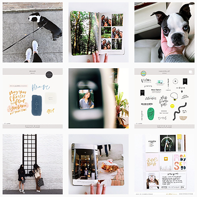
Here’s an example of a typical layout:

And here’s how I worked through putting it together.
STEP 1: SELECT THE PHOTOS
I begin by determining subject and space: what to document (subject) and whether it’ll be one page or a full spread (space). Once I have a rough idea of those parameters, I scroll through my phone and “favorite” the pictures that might make the cut. Then I go through my “favorites” folder on my phone and further whittle everything down.
On the left side of this layout, I documented a week-long visit from my sister and nephews.

I took hundreds of photos that week, but I only edited and printed eight for this layout. It’s a snapshot of their time here with the blanks filled in with journaling.
Done is better than perfect, so the pressure’s off to select the absolutely right photo. The most important thing for me these days it to just get it done.
Sometimes (especially with the kids) I end up with a series of photos and I want to include more than one in a series. I always leave the “multiples” in my favorites folder, edit them just in case I want to use them, and put them in a template if I want to include a series (more on that in a minute).

STEP 2: EDIT THE PHOTOS
These days I’m doing all of my photo editing on my phone. I upgraded back in January to an iPhone 6S from an iPhone 5 and – hello! – the camera is insane. I’m using it for just about everything these days including photo editing.
I’ve become pretty attached to A Color Story app from the team at A Beautiful Mess. You can buy filter packs to use, but I usually use the built-in tools to increase exposure, sharpen, or brighten depending on the quality of the original.
For a series taken on the same day, like the ones on the right side of the layout, I’ll make a few adjustments on one photo then save them in the app to use on all the other photos from that day. It saves time and keeps it all looking cohesive.

STEP 3: PHOTO TEMPLATES
Once the photos are selected and edited on my phone, I move to the computer and use Photoshop to edit the templates I’ll use in my layout. My favorites are Liz’s series of 4×6 photo templates. They’re simple, effective, and you can easily add captions.

In this layout I also used a few of the templates from all the stripes to add a little pattern to the mix. Photo templates are a quick and easy way to add journaling, inject white space, and include more photos.

STEP 4: ADD TEXT AND CAPTIONS
Once I’ve selected which photo templates I’ll use, I add text that captions photos, creates “titles” on photos, and generally fills in any details I want to make sure I don’t forget.

Lately, I’ve been including itineraries or lists of things we did on a trip or that week. Sometimes I’m more prolific with captions, but usually they’re pretty straightforward and brief. I find that a little text goes a long way toward triggering a memory. You can find more ideas for including text in your layouts here.

STEP 5: ADD PATTERN, WORD ART, EMBELLISHMENT
This is my favorite step, and I almost always save it for last. Once the photos are printed, I lay them out in the pockets and fill in with word art, patterned cards, and the occasional embellishment.
For this little card, I printed a pattern from bloom papers and added a little sticker from the moments like these kit.

I’ll often use word art on its own to include white space and a way to “title” the page.

I’ll also use word art alongside my own text to create a little bit of journaling. In this layout, the templates from all the stripes added a good amount of pattern, so I didn’t need to add much in the end.

After several years of doing Project Life, I finally feel like I’m working through it at a pace where I can keep up, document the most important moments, and have a creative outlet. What’s your process these days? I’m curious about your favorite steps or the places where you get tripped up. Let me know in the comments!
I hope you’ll sign up for my upcoming newsletter, see what’s inspiring me these days on Pinterest, or check out more of my projects.
xo, Catherine
Products used: all the stripes photo templates, smitten word art, 3×4 photo templates, 4×6 photo templates vol. 1, 4×6 photo templates vol. 4, bloom papers, sticker from moments like these by paislee press for stampin’ up / pocket pages by becky higgins (design a + design 5)


I love it! I would love to have this kind of monthly flow, too! How do you decide which stories do fit in? Does this come with practice? And I would be interested to know if you keep up with the photo books. Because sometimes I think a “best of project life” would be awesome, better than being overwhelmed with so many photos and doing nothing with them.
Have a great summer! Xoxo from Basel,
Julia
Hi Julia! Thanks for your comment 🙂 I do think that knowing which stories to include (more like “deciding” which to include) just comes with practice. For our time in Europe, I’m really just picking the major highlights of the month, which have been obvious. Our day-to-day pics are going in photobooks. When our boys start school in the fall this will transition to their school albums. I’m documenting those school years with Project Life, but because they’ve been home with us while we made this move and transition, these layouts will really fill in the eight months or so they’ll have been out of school. For the bulk of our family’s story, I’ll be using photobooks. I just set aside the pics I want to include each month, and I’ll probably start working on it when they start school in the fall!
I just love your approach! Everything just fits in. Can you tell us about the lovely font that you wrote the journaling on the pic of Step 4? Looks like Perpetua, but seems curlier though. Maybe i’m just crazy haha.
Hi Geani! I think that font is probably Aleo – it’s one of my faves. I like that it has multiple weights, plain and italic options. And – bonus – it’s a FREE download. Check it out: https://www.fontsquirrel.com/fonts/aleo
I’m sure you know how to download and install fonts, but I did a blog post on this just in case: http://www.green-fingerprint.com/2013/01/download-install-free-fonts.html
Enjoy! And thanks for the comment 🙂 xo, Catherine