Hi there, it’s Jamaica. Lately I’ve been obsessing over two things—taking walks and the new Everyday Edition that Liz designed.
Despite this being my 4th year keeping a project life-style scrapbook, I’ve never actually bought a core kit before. Do you know how many cards come with it? A crazy amount. Enough that I don’t feel the need to hoard them, which is awesome. The one thing that I was a worried abut before getting the kit was that the cards have rounded corners and I’m a square corner gal. Some people mix and match with ease, I’m just not there yet. But what I realized quickly is that just because it’s a core kit doesn’t mean you have to use it like a core kit. There are a billion ways to make it your own. So today I thought I’d share two spreads from my scrapbook using Everyday that get around the corner issue without even noticing.
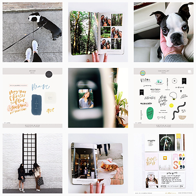
HELLO. The time I spend walking thru the neighborhood, up and down the hills, has become my favorite part of the day. I love watching the yards change as houses are bought/sold or re-landscaped to be drought-tolerant. My Instagram feed is filled with the color and texture of my favorite plants and succulents, just waiting to make it into my book.
The idea for the column of vertical handwriting/title/photo was inspired by a catalog that came in the mail the other day. This seemed like the perfect place to try it—it gives me room for journaling and the photo of my feet which felt out of place with the plant photos. Using vellum allows the two pages to feel connected but also stand on their own. I love how the vellum mutes the photos beneath it making a really colorful reveal once you turn the page. The torn edge of the photo softens the transition between the journaling and the image, and works nicely with the tilted lettering of the hello chipboard sticker.
By adding my journaling, title and feet photo to the overlay, I was able to fill the page beneath it with a collage of photos and cards. I love love love the colors and patterns in Everyday. After printing out my photos, I just flipped thru the stack looking for colors that would look good with the photos then cut them down to 2″ x 2″. No corners, no problem! The small squares are also great for using the horizontal cards included in the kit. Most of the 3″ x 4″ cards with sentiments will fit perfectly into the small, 2″ x 2″ squares.
HAPPY PLACE. The boys loved going to the beach so we spent most of their visit hot, sandy and happy. Again, I printed out my photos and then searched my stack of Everyday cards for colors that would match. In this case, I landed on the soft aqua watercolored happy place. Perfect color, perfect sentiment. And, it just happened to be a 4″ x 6″ card so I just trimmed it down to fit into my 3″ x 4″ pocket.
The real challenge was what to do with the 3″ x 3″ photo in the bottom right corner. I wanted to keep the photo as large as possible but was struggling with plopping it onto a regular filler card. I needed a way to add an extra inch without looking like it was an afterthought. As I looked thru all my cards for an option that would pick up the same colors, I found a title card with a box in the same soft aqua that would make the perfect “bottom” for my photo.
Here’s a quick look at how I did it:
Just trim the top section off, carefully cutting along the edges of the box (so that it will pop up over the photo) and cut 1/2″ off each side so that it’s 3″ wide. Then run a piece of washi tape along the back, joining the edge of the photo to the edge of card and trim it down to 4″ tall. Voila, it’s now a 3″ x 4″ card with square corners! And the perfect spot for a chipboard banner.
Dear Everyday Edition, YOU are my favorite.
xo, jamaica
PS. Everyday has a digital edition too. : )
See more of my projects here or follow me online at my blog, on Instagram or see what inspires me on Pinterest.


Everything about this is beautiful. Yesterday I received my first ever physical edition too – this one of course and had the same concerns and thoughts about rounded corners! I have the digital version too so plan to mix it up but just love your ideas:)
This is gorgeous, Jamaica!
[…] time, but I wouldn’t hesitate to put them in my cart for another order in the future. Anyway, Jamaica used it in an album and it looks fabulous. The same designer also created the Midnight edition, which is now my second […]