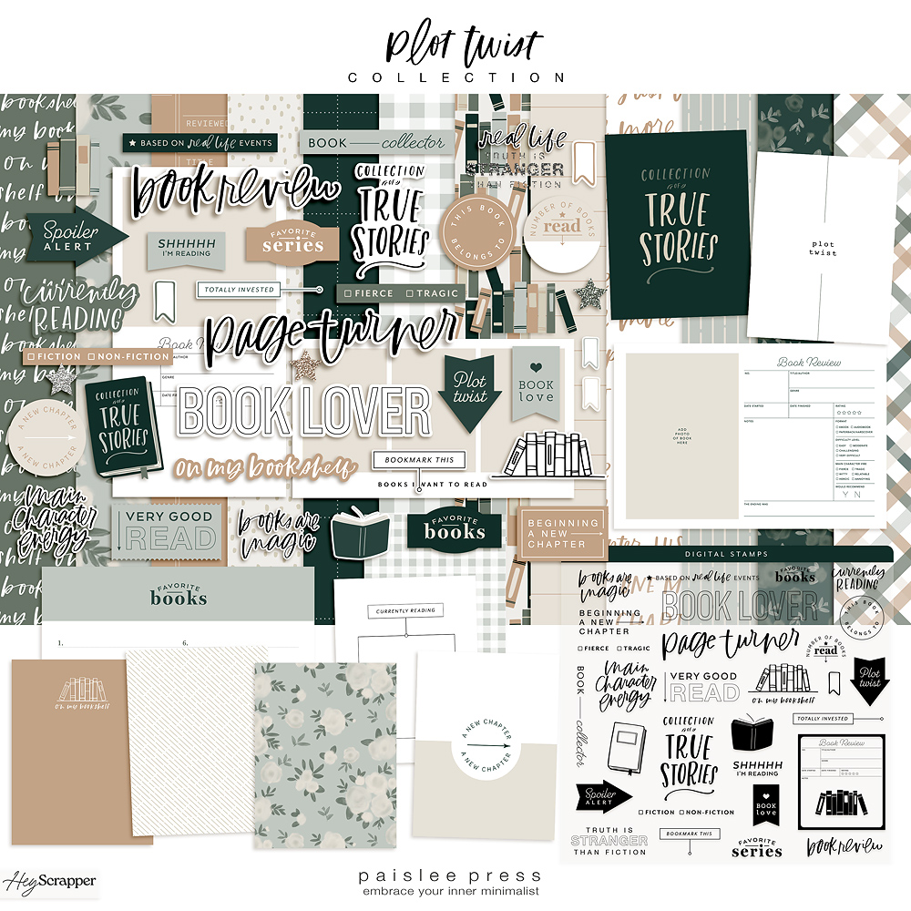
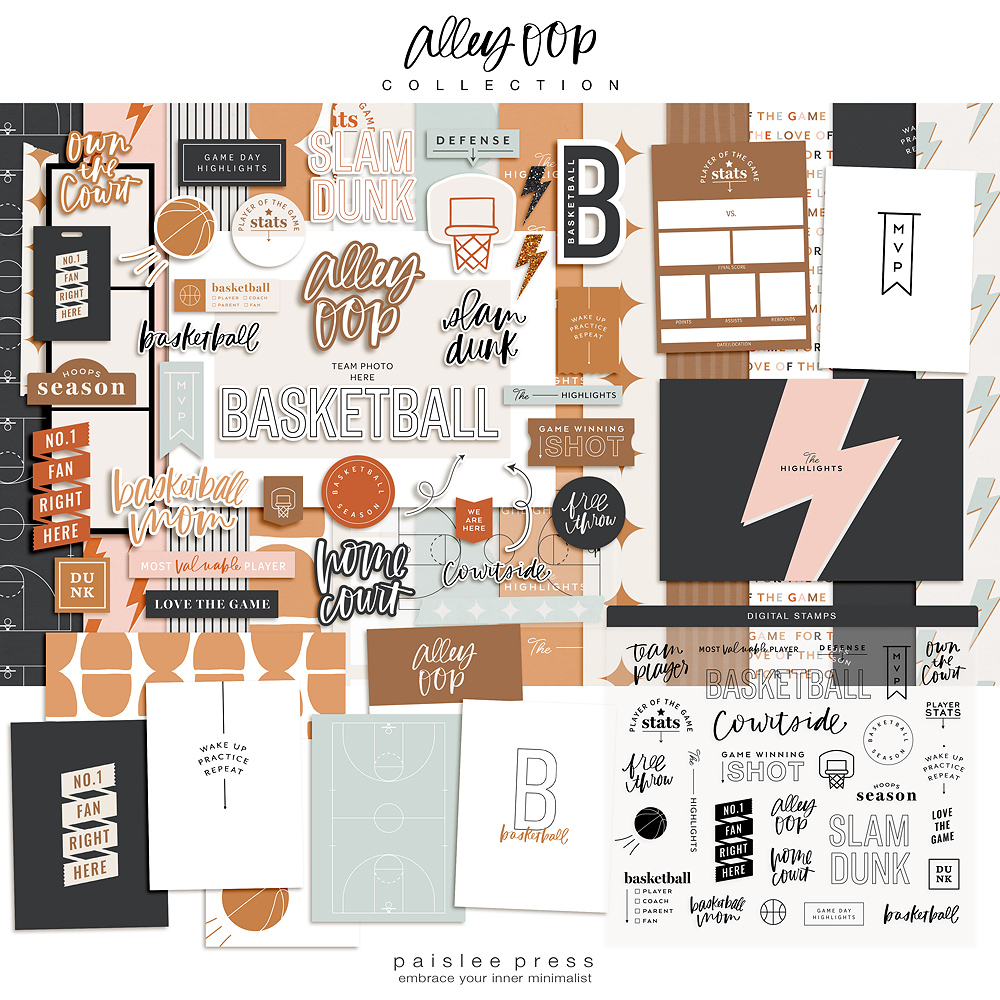
Most of my pocket page layouts consist of a few staples: 4×6 photos, a few 3×4 photos and some patterned cards mixed with a little journaling. I find that keeping it simple helps me continue working through my albums. But I still spend some time fussing with the details. My favorite part of the creative process is picking the patterns that will fill the extra 3×4 pockets. I use digital paper packs to create little cards, which add a lot of impact with even a little bit of pattern. The digital papers mixed with word art and the minimalist templates have become my go-to formula for assembling a simple layout.
For this layout, I started by printing a stack of photos. The only extra step I took before printing was to use 4×6 photo templates vol. 1 to print two photos on a 4×6 for a few of them.
I arranged the photos in a couple of Project Life Design A pocket pages, one of which I trimmed down the middle to create a 6×12 insert. With the photos in place, I had six 3×4 pockets to fill with a mix of patterned cards and journaling.
In order to conserve paper and save time, I like to batch print a bunch of cards on one sheet of card stock. I start by creating a blank 8.5 x 11 inch document in Photoshop (I’m using Photoshop CS3, but you could do the same thing in Photoshop Elements). For this layout, I added five 3×4 rectangles, which I used as clipping masks. I adjusted the size of two of them so I could add text underneath the patterns.
Caylee has a video in her post on recoloring your digital supplies which shows you, step-by-step, how to use a clipping mask. Essentially, I drop patterns into each rectangle, which allows me to print all the cards on one page. Here’s the final file in Photoshop, with some text added using minimalist 3×4 templates.
I print the cards on one 8.5 x 11 inch sheet of white cardstock and trim them to size.
Printing on a larger sheet of paper allows me to get the effect of a “full bleed” patterned card, which just means the pattern goes all the way to the edges of the card.
When I’m just printing some text on a white card, I run a 3×4 card through my printer on its own. You can see how I print directly on journal cards in this tutorial.
With the cards printed and cut, it’s just a matter of slipping them in the pockets and my layout is finished.
Here’s the first side of the finished layout. I used a 12×12 pocket on the left to include a piece of Ben’s original art from school, and the halved Design A pocket as my insert.
Here’s the layout with the insert flipped over. I try to use a mix of colorful and neutral digital papers that compliment the colors in the photos.
You can check out more of my pocket page layouts here, see what’s inspiring me on Pinterest or read more about my creative process on my blog. And please be sure to say hi on Instagram!
Products used in this layout: #mytribe digital papers, bloom digital papers, minimalist 3×4 templates, “currently” word art from pictures and words no. 16, 4×6 photo templates volume 1. Project Life supplies by Becky Higgins including Design A pocket pages and 12×12 paper from the Midnight Edition.


Love this …thanks
Do you photograph your kid’s art or scan them? I like the way it looks here.
Hi Moi! In these shots it’s photographed on a piece of white foam board. I like how it looks too!