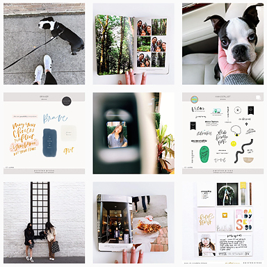
 Hi everyone, it’s Carly here to share a few of my February project life pages with you. This year I made the switch back to a 12×12 binder from the smaller 6×8 handbook size and so far I am loving the larger format once again!
One of the main reasons why I decided to go back to a 12×12 binder is because this year I am including all of my documenting into one book. Whether I create an 8.5×11 scrapbook page or a 12×12 project life layout, it’s all going into this book.
 What I really like about keeping everything in one book, and not restricting myself to just creating 12×12 pocket pages, is that I feel completely creatively free. If I want to document a story or even an entire month review on an 8.5×11 page I will and having that flexibility has made documenting this year stress-free and fun.
 My original plan was to only use the Design A photo page pockets thinking it would be easier and of course create a more consistent look throughout my binder, but when I decided to be just flexible with my 2015 documenting I opted to use whichever photo page pocket that fit with the pictures I was documenting. So far I’ve been switching it up a lot and using Design H, I and K, in addition to the traditional Design A.
For me, creating a documenting system that is flexible, simple and yet still allows me to express myself creatively is key if I am going to be successful at keeping it up. I’m a big believer in finding an approach that works best for you and being open to changing it if it ever starts to feel like it’s not working anymore.
– Carly
To see my other Paislee Press projects you can visit here, and of course you can always visit me at my blog, on Instagram or over at Pinterest.
Products used in today’s project: minimalist 4×6 photo templates, press cards no. 23, press cards no. 16, picture + words no. 18, 2015 journal cards, and picture + words no. 5.


awesome…really love it.
So beautiful, really love the black and white effect