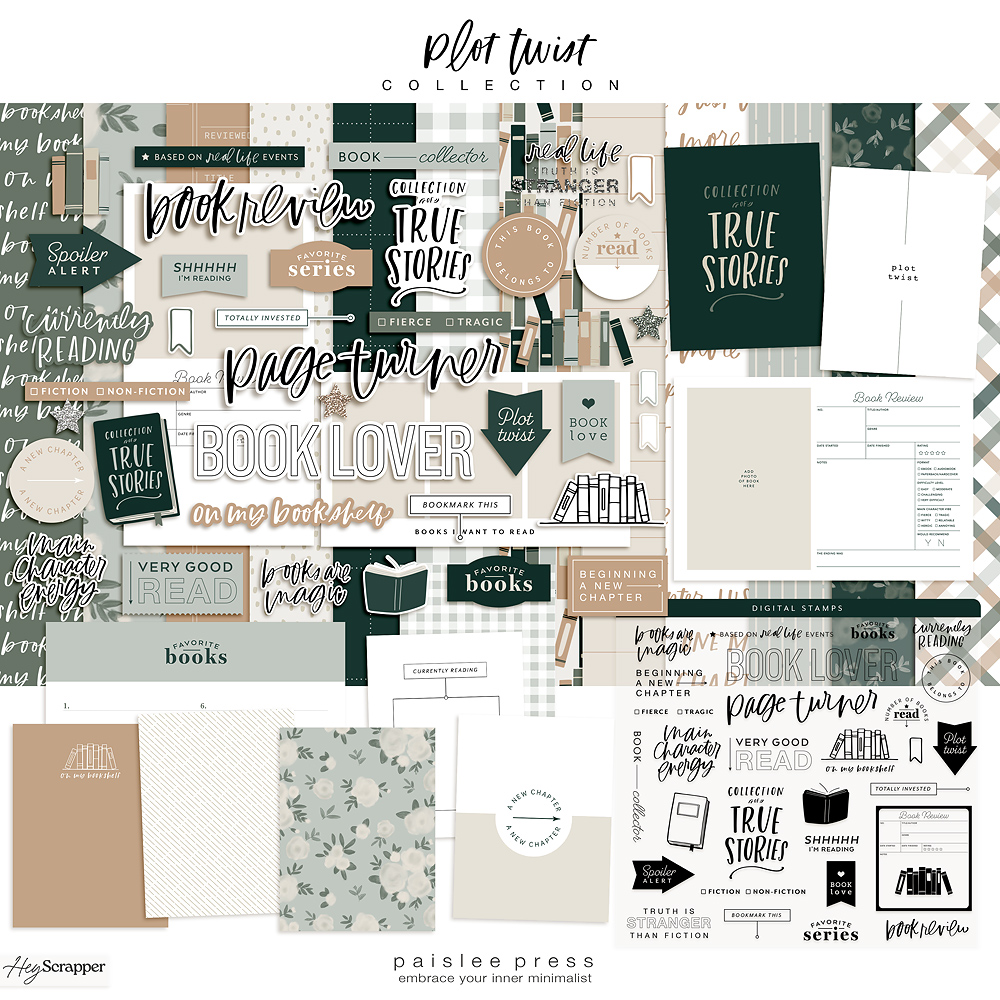
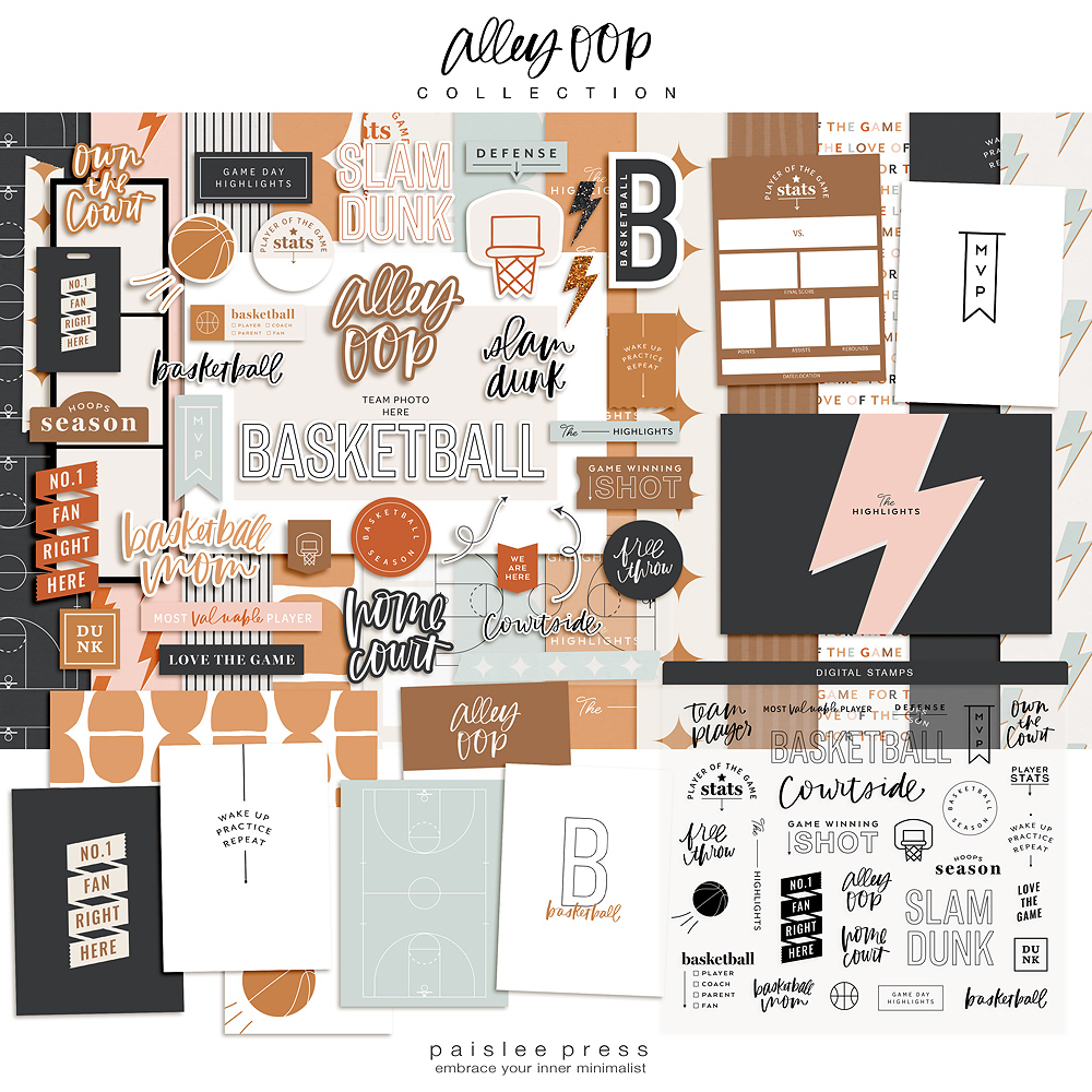
Hi, it’s Jamaica again. Today I’m sharing the results of my latest crazy idea… digital overprinting. I love the look of make-readies where letterpress and screenprinters do test prints over already printed sheets of paper. So I thought I’d try the same thing here at home using pages from catalogs and other bits of paper I’ve been saving.
I started by looking thru my old catalogs and magazines for pages with bold typography and colors that appealed to me. Because I plan to cut the final pages down to pocket-size for use in my scrapbook later, it doesn’t matter if the wording doesn’t make sense or part of the image is strange. They’ll either be cropped out or obscured by ticket stubs or labels when they get put into use. Basically, they’ll make interesting background papers.
1) pluses from quintessentials no. 4 on blu dot catalog, 2) neon dots from in progress on anthro catalog
XOXO from eternal sunshine on 1) page from surfing magazine, 2) anthro catalog
1) aqua pattern from outdoorsy on Beer + Food calendar, 2) speckles from eternal sunshine on Lunar Calendar
Some pages definitely turned out better than others. Here’s what I learned:
- Uncoated paper and pages with with minimal ink coverage work best in inkjet printers. In the chair image above, you can see how the XOXO didn’t stick/dry as well on the part of the image with more ink coverage, leaving tiny bubbled letters even after it dried. Whereas on the left, where the majority of the page was blank, the patterned overlay is smooth and even. If you’re printing over a busy background, be careful handling the printed page, giving the ink time to dry.
- Pattern selection is important. If you want more of the background image to show thru, select a pattern with more white space. The XOXO pattern is so dense that it obscures the original image of the ocean compared to the pluses pattern which only embellishes the original image.
- White backgrounds are the best. Printing a small pattern with a solid colored background over both calendars turned out surprisingly well. The overprinting effectively changes the color of the original design which still shows thru.
- Laser printers. Because laser printer’s ink isn’t wet like an inkjet printer, it is better equipped to print over glossy pages and images with less white space, just make sure to load your paper thru the manual tray since it’s likely to be thinner and need more delicate handling to prevent wrinkling.
Here’s a spread from my album showing how I used two of my favorite digital overprints. The image on the left is a little strange to be including in my album but I love the grouping of portraits in the background (I’m starting a collection of portraits myself). And the yellow dot—I love how the bold black lettering grounds the ticket stub layered over it. They’re fun and interesting additions to my book. I’d say this experiment was a success.
The next time you get something good in the mail or turn to a new page in your calendar think about how you could use that page, embellish it with a bold pattern, and use it in your next craft project.
xo, jamaica
See more of my projects here or follow me online at my blog, on Instagram or see what inspires me on Pinterest.


so cute!! glad you gave this process a name finally, cause saying “i ran this coc catalogue through my printer” just doesn’t sound as legit!! (clapping emoji)
um, this is absolutely freaking brilliant!
Holy whoa! This is such a fabulous idea…would be PERFECT for art journaling.
love Love LOVE!!!
This is genius. I love the elements you chose to mix. Total win.
awesome! You are always such an inspiration:)
Jamaica – these are amazing!
Love your creativity.
Ronnie xo