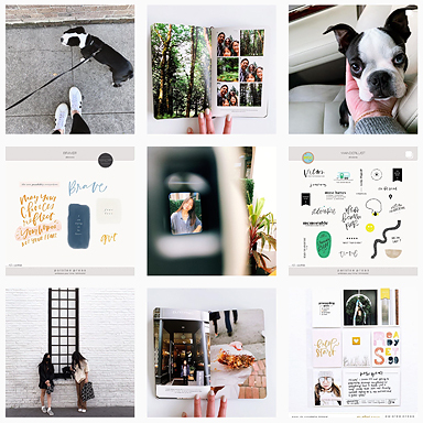
Hey, it’s Jamaica again. Thought I’d show you a quick trick for making a collage of small photos and papers using the month at a glance template. The template is designed to be 8.5″ x 11″ but if you omit the last row on the right and the bottom row, it works for smaller albums too. To make it easier to see my “page” while I was adding patterned papers and arranging photos, I just turned off the layers with those boxes.
Picking up the colors from the left side of the spread, I pulled textured solids for the non-photo squares from Say Yes To and Quintessentials No. 4. The benefit of using a template is that you can add, subtract and rearrange as much as you want before you print it out. That way you don’t need to go back and print anything else later (which I almost always end up doing, because I change my mind a billion times).
For a moment, I considered leaving the page intact—it fit right into a 6″ x 8″ page protector—but the white lines were too distracting for me.
Carefully cut apart, the blocks fit perfectly into the October Afternoon Daily Flash page protector. No need for extra trimming, none of the photos are smaller than the other (an annoying result of printing my own grid of squares onto a 4″ x 6″), it’s just right. Here’s what my finished spread looks like… quick and easy.
xo, jamaica
See more of my projects here or follow me online at my blog, on Instagram or see what inspires me on Pinterest.


This is really effective and looks awesome once placed in the pockets, love it!
Could you please tell me what font is used for that nanny text? Your page looks lovely, like the colors!
[…] Details on how I altered my page protectors to fit the 3×8″ daily logs are in my previous post. I use Studio Calico’s Handbook and page protectors (they are changing their designs right now so any links I provide will not be useful). The 2×2″ page was an October Afternoon Daily Flash page. I used a Paislee Press month at a glance template to make the page (turning off some of the boxes to make it 6×8″ sized as shown here) […]