A while back I mentioned that I was trying a new size for Project life. I was debating between 6×8 and 8.5×11. Both appeal to me for different reasons. The 6×8 format lends itself easily to full photo spreads. Pairing a full photo spread with a collage of smaller photos is my favorite. That’s the formula I used to put together my December Daily album and photobooks so it feels most natural for me. But I imagine I can easily fill at least four 6×8 albums to complete a years worth of photos and space is also a concern for me so I decided to give 8.5×11 a try.
Events Based Pages. The first few layouts came together so easily, in part because of the newness of it. But mostly, I think it’s because I’m doing spreads based on events/themes vs. the “what happened this week” approach I used in previous years. I find it much easier to work with a group of photos that have a common theme (they often have the same colors, tone, mood, etc.) so the photos naturally have a cohesiveness to them. That was one of my biggest struggles with the weekly format – trying to get an eclectic mix of photos to look good together.
Event: A Saturday In February 2014. Not an official event per se, it was just one of those I-love-every-single-photo-we-took kind of days.
Event: A day spent at Disneyland.
Theme Based Pages. One of the advantages of working with a wider time frame (month vs. week) is the ability to group photos that share a common theme. I suppose it can be done with the weekly time frame too, but I find it’s much easier to identify themes over a longer span of time.
The theme here is Madeline’s playdates in January. I like that these photos are together vs. spread out over the weeks. I think it does a better job of conveying how their friendship is such a huge part of her life right now.
Month In Review Spreads. So far I’ve been making several in-review pages for each month. These are great for “catching” the photos that don’t make it on the events pages and for slipping in random/miscellaneous moments.
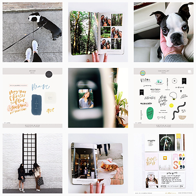
January 2014 via Instagram. I use Instagram to share my favorite photos so it just makes sense to have this documented in PL. These square coin pockets are perfect for Instagram photos. I used this Month At A Glance template to arrange and print out the photos.
Bonus: Two big January events (the CHA show and Disneyland w/Peppermint) were well documented via instagram so I didn’t feel the need to make additional layouts.
Another Month In Review page for January. This is where I placed random photos taken throughout the month.
So this is where I’m at with Project Life 2014. To be honest, I’m not 100% certain that I’ll stick to this size. I keep wavering. When I get the pages right I love the letter size format. When it’s not coming together, I find myself thinking maybe I should have stuck with 12×12.
How is your Project Life album coming along?
Products used:
……….
Project Life is a memory keeping system created by Becky Higgins. Read more about it HERE. All of my project life entries can be found HERE or browse the entire project life gallery HERE. Photos edited using PicTapGo, RadLab by Get Totally Rad! or VSCO


Although I’ve stuck to the 12×12 size, I’m also going with a monthly and by theme approach this year.
I haven’t done much though in terms of spread yet (I take and upload pictures and write down daily notes) since I’m sort of following Becky’s advice now and batch process it. Which means I’m really gonna start working on it in July, once school’s out and I’ve got some free time, and I’ll have a better understanding of what I’d like my first album to look like.
Anyway. I like what you’ve done so far esepcially in terms of the events/themes.
Oh Liz,
Every layout you’ve shown here is just beautiful.
I think I’ve managed to push through my wall and get back into a rhythm with my weekly spreads.
(For now…)
Ronnie xo
It’s beautiful, I’ve been waiting for your post on working with 8.5×11. I too decided on this size cause I just didn’t like the huge 12×12 books. Makes so much sense for me cause my printer and silhouette are that size too. If they made 10×10 I’d do that but for some reason manufacturers won’t pick up on scrapers wanting that size. I hope you do templates or cards for the trading card size pockets. I use WeRMemory Keeper ones. My plan is to go back and do the years my kids were young (as soon as I get my pictures organized.) Meanwhile I’ll keep watching for your inspirational pages. Thanks so much.
LOVE your pages and understand the logic of grouping similar photos together. I struggled a bit with that on 12×12 so have swapped recently to 8.5 x 11. Loving it so far. Have just had one wee moment of missing the ease of 6×4 pockets!
How do you print the photos to fit in the trading card size pockets? I’m doing a travel album this size but I didn’t realize I would find it so difficult to print the photos. Any advice would be greatly appreciated 🙂
I love the look of your 8.5 x 11 layout. I am also wondering how you print your photos. I am using Paislee Pressplate 39 letter size but am having trouble getting the proportions exactly right. Is there another template that works with 8.5 X 11 page protecters? Thanks!
Hi Nicole,
While Pressplate No. 39 is a 9-Up photo template, it wasn’t made to be compatible with the baseball card pocket pages. I don’t have anything in the shop that’s specifically for baseball card pocket pages but I can get that in the shop if there’s interest. Hope that helps!
Your templates are just my speed! I’ll keep an eye out for them in the possible future.
Thanks for your help!