hello again! i can’t believe it’s been a month since i last posted. feels like yesterday!

(products used: march, xo paper and alphabet card)
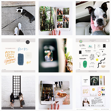
the end of march was all about adjusting to some life changes… which means COFFEE. somehow i ended up at three different bouji coffee spots in one week. (lakkris latte, anyone?). the third row down has a photo from the shop, the cup holder from a different (but equally pricey) shop, and an actual cut down cup from yet another fancy place to commemorate the week of excess. i shrunk down the march title to fit in a 2×2 square and once again used my beloved alphabet card, but on kraft to coordinate with the woodgrain card. a vellum girls quote and the matthew wilder quote (text from a friend about chloe) on the xo paper are some more moments from the week that just needed some documenting! i also finally went to the brooklyn art library to see some of the sketchbook project journals, so i used a tag from there as well.

(products used: xo)
my favorite moment from the spread above is the xo sprinkles. i cropped the xoxo to just one xo, then copied it, changed the sizes and the orientations. so cute!!! i also included documentation from recent shopping trips (because after you drink all the coffee, you shop to deal with change, right? don’t worry, i returned everything i bought at anthropologie. their prices are ludacris, even on sale). i did however, include a piece of an old anthropologie catalogue that i’ve been saving since at least 2005. the see through square in the center was left empty intentionally, so i could add some of my favorite aqua rhinestones and wood veneer stars.

(products used: april and hey)
here i used the month stamp at it’s full size, which i just love. it’s nestled in between some quotes from a friend, which i deemed “the voice of reason”, because she always just says things that are true when i am lost in my own insane thoughts. i love the way my printed out version of the hey button was the exact same size of the glass of dark and stormy slushies (highly recommend, if you ever find yourself in greenpoint!!!) so i had to paste it on top.

(products used: happiness and you are perfection)
i used the april stamp again here, but as an additional layer to a test print. i love the way the variation of inks allows different hues to shine through. super fun!! i made my own cards for the cut up magazine pocket and the kraft paper pocket, and the DYI is done on purpose, as a friend absolutely refuses to get the letters right and now she just says DYI anyway and it makes me laugh. stubborn, on purpose things always make me laugh. two quotes from a friend and an envelope window cut to show the back of a card featured on the previous spread finish up last week and just like that april is almost over and i’m paying may’s rent. where is this year going!?
Follow Kristi: pinterest I instagram I twitter I tumblr I blog
You can find all of my hybrid project posts here.


very nice pl you’ve got.
can i ask from where you got your 2×2 page protectors? is it compatible with studio calico 6×8 albums? thanks.
they are standard slide pockets that i cut down and then punch holes in. anything is compatible when you have a hole punch!
Your pages are always so interesting and your colour palette is gorgeous! Totally with you re where’s the year going! Was just talking about that this morning.
thanks donna!!!!
Be still my beating heart! Kirsti, this is stunningly beautiful. I have always known you have a fantastic eye for colour but this is a whole new level. Favorite pages ever!
wow, thanks!!! blues and greens are my jam 🙂
Seriously? I have the biggest scrappy crush on you, Kristi!!
hahaha thanks girl! we have a lot in common, with being single and scrapping our dogs all the time :/
Hehe, I wouldn’t have it any other way! 😉
I love the colors and the overall “visual journal” feel of these pages. So, so great! Love and Coffee forever, and that April card is my favorite. 🙂