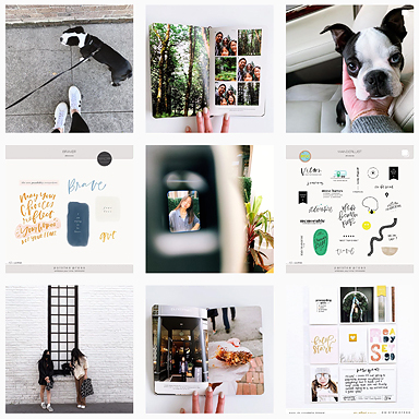
My 2013 album still lots of gaps everywhere and I’m not sure when I will finish it at this point. If you’ve been following me on instagram you probably know that I recently switched to a different size – 8.5×11 and wow, I’m loving it. I’ll share more of how that’s going in the next few days. For now, I’m posting some of the pages from 2013 that I never got around to sharing here.
This is week 31, a 12×12 page paired with a 6×12 insert. Super simple again, just photos and a week in review card.
This is Week 32.
The yellow ampersand card (by LifeLovePaper) is one that I’ve been hoarding for years now. Feels good to finally put it to use. I love how it pops but still makes sense here because of the yellow hues in the surrounding photos, especially so with that yellow dress from Anthro.
On their first day of school, each of them signed their names on their half of a blank 3×4 card. I like having this record of their penmanship in the album.
How’s your project life album coming along this year? Have you made any changes?
Products used: Design A + Design H page protectors, 3×4 white cards, 4×6 photo templates, Week in Review Cards
……….
Project Life is a memory keeping system created by Becky Higgins. Read more about it HERE. All of my project life entries can be found HERE or browse the entire project life gallery HERE. Photos edited using PicTapGo, RadLab by Get Totally Rad! or VSCO


Just wanted to tell you I love your work!! The Frozen dresses are absolutely amazing and your girls are so beautiful. Loved seeing the blog on them going to Disneyland to meet the characters-what fun! Also the dresses in process post and the way you are doing it for PL is genius.
Thank you so much Cele!
I always love seeing your pages and looking forward to your new format. I started off the year determined to keep to mostly one size of page but by week 3 that went out the window!
Lol Donna! I do like the look of different page/pocket sizes in albums. It’s fun to mix it up. 🙂
I love seeing your photo spreads! I’m wondering – how did you create that format in the bottom right of your second photo? I’ve been looking for a great format for Instagram photos, and really like this one a lot!! (If that is a square format picture…? I can’t really tell from here). Anyway, lovely work as usual!! Thank you so much for the inspiration. 🙂
I created a square clipping mask on a 4×6 file in photoshop and inserted the photo. If you’re using instagrammed photos, you can simply add them to a 4×6 canvas, since they’re already cropped to a square. Hope that helps!
the biggest thing for me was figuring out why i wasn’t happy with how my spreads came together… i realized…. it was the title cards! using one from the PL kits always broke up the flow, I thought, so I started using a photo of me standing out on the street each week and having a photo in that spot has made SUCH a difference.
loving your new products Liz. Eternal sunshine is AH-mAY-Zing
Love it. That is TOTALLY BRILLIANT Rachel.
i *love* these pages…especially the insert documenting one hour of the day, i’m sure it will be so interesting to look back on in years to come. so i have a very silly question that i’m sure you’ve answered lots of times – i’m cringing to be the person that asks for the 101st time!! anyway, here goes 😉 i was wondering which fonts you use for PL? i love how using a curated selection of fonts makes your spreads so cohesive! personally, i’m having trouble finding a classic but modern font for journaling on cards and on top of photos that will withstand the test of time and carry through from year to year. maybe it is the idea of committing to that one font and fearing that in a few months i’ll change my mind that’s stalling me in my quest to start PL – the perfectionist in me doesn’t like the idea of having 3 months with one font and 2 months with another and so on…typing it out sounds crazy, lol!
My go to fonts are american typewriter, helvetica and bebas neue. Don’t be afraid to experiment. Pick something you like and try it out. If you notice that a certain font constantly catches your eye, chances are it will be something you like three months later.
I’ve been using the same “core” fonts for over 6+ years.
Love your pages!!! They’re so easy on the eyes!
So great to see your pages, Liz! What a sweet idea including the girls’ “signatures” – just love love love that. Precious.
So interested to see how your smaller format 8.5×11 project life is going as I want to switch to that size, too. Love your style.
Thanks so much Anika! I’m hoping to get a post up for the new size very soon!