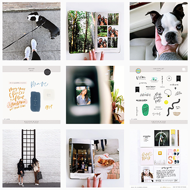
Hey friends! It’s been awhile since I’ve shared my project life pages here. This is Week 27. Continuing to keep it simple with a focus on photos and words.
Here I added this quote I pinned on pinterest to go with this self potrait we took on 4th of July.
A simple 3×4 Week in Review card. Continuing to use this design every week to maintain a cohesive feel throughout the entire album.
On Saturday we took the girls to ride their bicycle and scooter at the park but I didn’t get any photos of them riding. I used the one photo I did snap and added the “Saturday” (from Pictures + Words No. 5) along with journaling.
All the photos used this week were taken with the camera phone and edited on the phone (using PicTapGo). I love that the photos are “done” and ready to go as soon as they’re uploaded to the computer. It’s made the process of pulling together this weeks entry that much faster!
“She’s my best friend,” is something they’ve been saying to each other a lot lately. The circle template is from Pictures + Words No. 6.
Products used: Design A page protector, Design H page protector 3×4 white cards, 4×6 photo templates, Week in Review Cards, Pictures & Words No. 4 and Pictures and Words no. 6
……….
Project Life is a memory keeping system created by Becky Higgins. Read more about it HERE. All of my project life entries can be found HERE or browse the entire project life gallery HERE. Photos edited using PicTapGo, RadLab by Get Totally Rad! or VSCO


Oh my goodness! Incredible aricle dude! Many thanks,
However I am experiencing issues with yokur RSS. I don’t understand
the reason why I can’t join it. Is there anybody getting similar RSS problems?
Anyone that knows the solution will you kindly respond?
Thanx!!
My type of spread! Love it Liz. And I love the idea of halving a Design A page to use as an insert! I’m going to have to steal that idea, my dear friend.
Lots of love,
Ronnie xo
I’m pretty sure that is a Design H page protector, I use them all the time as an additional insert 🙂
Completely love your layout, as always! Thanks a lot for sharing.
So pretty, Liz. Love the white space on the 4×6 of you and the hubs. Love the insert. Love those week in review cards. Simple + beautiful. xo, C
[…] credits 1 / 2 / 3 / […]