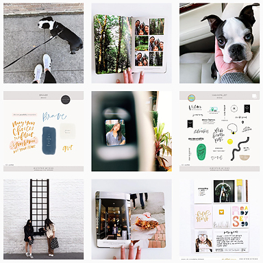
Hi! My name is Jennifer and I am guest blogging about my project life album for the month of October! Last year I used a traditional 12×12 album but this year I downsized to 6×8. Here it is!
On the left, I included some embellishment from a diptych no. 2 journaling card by cutting out the “morning scenes” circle and adhering it to the plastic sleeve with a foam dimensional. On the right, an element from pictures+words vol. 3.
I had a landscape photo from brunch that I really wanted to include but I didn’t want to take up an entire 4×6 slot so I used a card from pictures+words no.6 to accommodate it into my page. On the right I used an element from pictures+words no.7 and instead of adding the date like I had originally planned, I typed in a few words in photoshop.
Some quick journaling on the left and another element from pictures+words no. 7 that I recolored on the right.
In the photo above, I did something new for my album by overlaying a journaling card onto my photo. I wanted to incorporate the “magic” journaling card from the magic hour so I played around with it in photoshop to find a way to include it. I placed it over my photo but left a small margin around the sides (so it would look like a border) and decreased the opacity of the card until the photo underneath showed through. I did the same on the right with the “evening scenes” journaling card from diptych no. 2.
For the mint chocolate chip ice cream photo, I added an element from pictures+words no. 7 to make the picture more interesting. On the right I used the “Tuesday” label from writer’s block vol. 2. I had a blank space so I went with a diptych journaling card that I used as a filler card.
At the start of each new month, I use an entire side of a 6×8 page to include a photo representing that month with the corresponding month tag from the 2013 calendar kit. See how I also used it here for June. I always look forward to doing these!
A journaling card from fairytale, an element from pictures+words vol. 3 and the magic hour.
And finally, elements from pictures+words vol. 3, pictures+words no. 7, and a recolored and transparent tag from we to document a trip to Ft. Lauderdale.
Thanks for reading and letting me share my project with you!
Follow me on my blog // instagram // pinterest
 Jennifer Kang
I am a list maker, prospective occupational therapy student, lover of science, and Chicago native.
Design Motto: Clean and colorful with thoughtful and intentional typography. Embrace trial & error and always go with what works for you.
One day I’d like to: open a popsicle or ice cream shop.


drop dead gorgeous!!!! I love especially the overlayed magic card and I’m determined to figure out how to do it too. Thanks so much for the beautiful inspiration. Your pages are ALWAYS so amazing.
Thank you so much Susan! For the overlay, I used photoshop and added the journaling card right ontop of my photo as another layer and reduced the transparency!
love everything about these pages! SO GOOD.
Thanks Jodi!
Beautiful photos. Love them all!
Thank you so much!
What lovely pages. I’m starting to love the smaller format. Love what you did with the calendar page. Off to gawk at your blog now…
Thanks Caylee! The smaller format has been really fun this year! Dreaming up plans for next year…
Gorgeous work Jennifer – I love this!
Ronnie xo
Thank you so much Ronnie – I am a huge fan of yours!
I love your pages!
Amazing!!