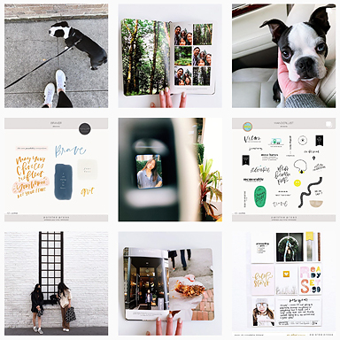
Hi everyone! It’s maryann, today I want to share with you week 35 in my Project Life album. This week I had some extra photos that I wanted to include so I decided to include an insert to show those off.
Overview of Week 35 with the front of the insert.
Overview of the first part of Week 35.
I used the His & Hers Journaling cards, papers, and elements on the majority of my cards this week.
Close up of the first part of the week.
On my title card, I used the Meant to be – Alphas to stamp the date on the card digitally. I used the Week in Review cards to highlight our main activities of the week. I used a vellum pocket as a photo overlay and stuck additional journaling behind the pocket.
Overview of the layout without the insert.
Overview of the second part of the week.
Close up of the second part of the week. I used elements from the On My Desk Collection to dress up the journaling cards.
Front of insert page. I used Becky Higgins Photo Pocket Design G. The Summer is my favorite is one of my favorite digital brushes!
The back of the insert. For the 4×6 card, I placed two 3×4 journaling cards side by side on a 4×6 document to give me a larger card for journaling. I used the We circle tags & stamps to create the circle tag and attached that on top of my journaling card.
Overview of week 35 back of the insert.
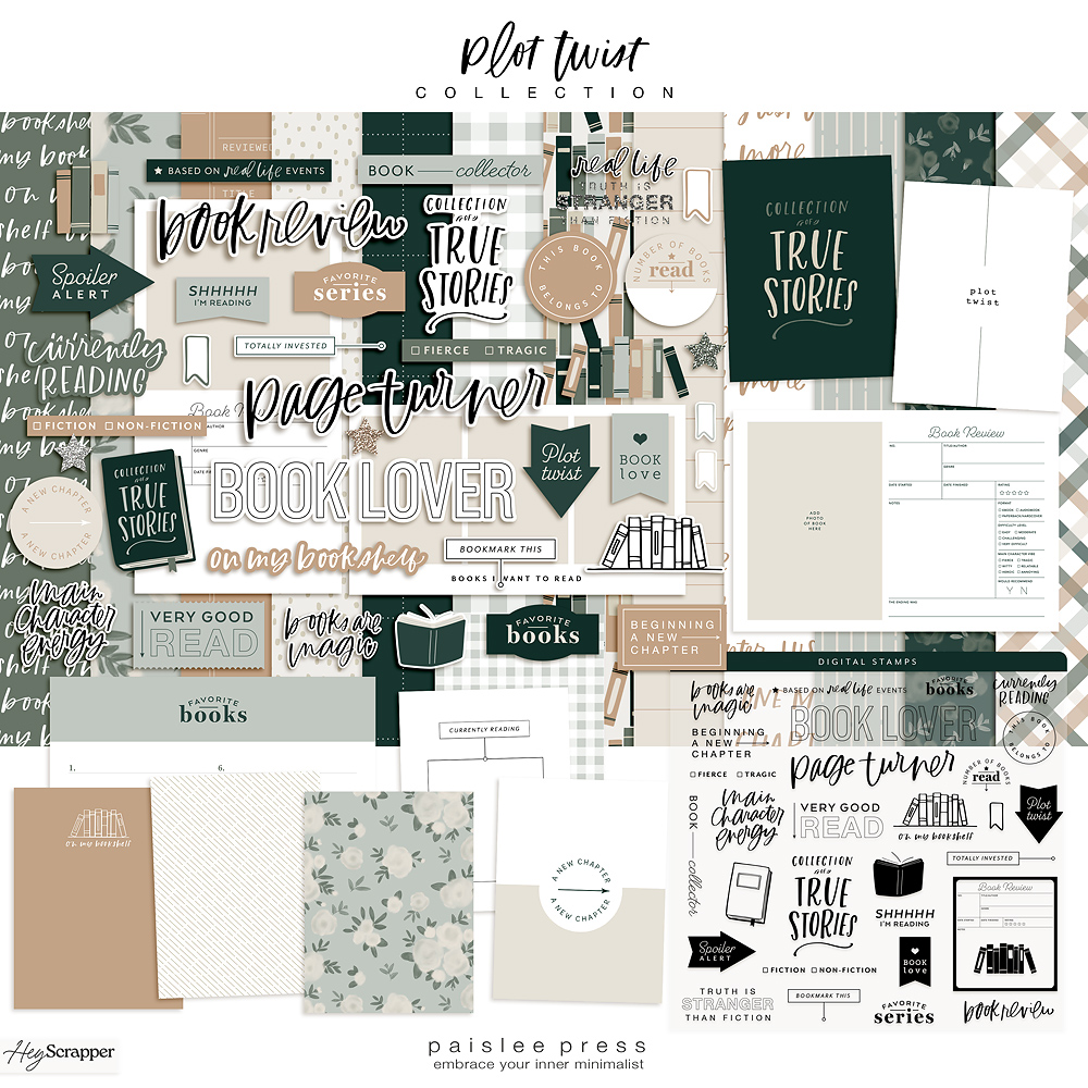
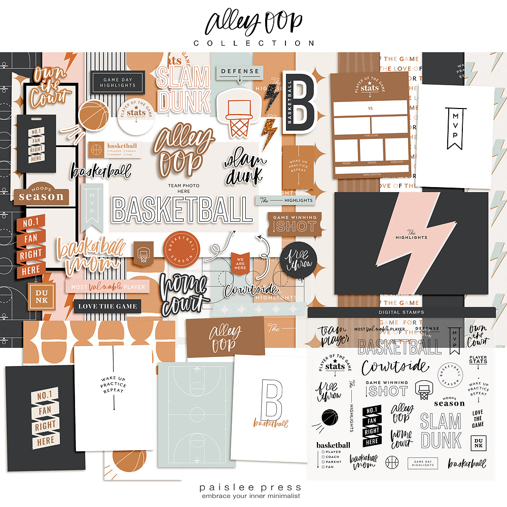
Supplies used: His & Hers Journaling cards, papers, and elements. Meant to be – Alphas, Week in Review cards, On My Desk Collection, Pictures+ Words #7, and the We circle tags & stamps.
Remember there are no rules when it comes to documenting your memories… do what works for you…. it’s your album and your memories!
-maryann
you can follow along with me on my blog, facebook, instagram, or pinterest


I love your layouts – thank you for sharing. Any tips on how you did the full page photo on the “Summer is my favorite”? I do my Project Life digitally and can’t figure out how to do that.
Thank you!
Hi Tiffany,
Thank you!! I love adding enlargements to my Project Life spreads. After I had edited my photo and had it the size I wanted to print it ( in this case it was the entire size of a photo pocket design G page protector 8×12) I opened a new file. I opened the Summer is my favorite png. I wanted the color to be white, so I selected the edit tab and clicked on fill layer, a grey box appeared, and I chose white for the color. I chose 100% opacity and clicked enter. This changed the color. Then I selected command a (on a Mac) control a (on a PC) for select all and then command c (on a Mac) control c (on a PC) to copy. Then I went back to my photo and hit command v (on a Mac) control v (on a PC) to paste the png onto the image. Then you are able to use the mouse tool to move the png file anywhere on the photo. I used my ruler tools to make sure that the png would be in an area that would not be cut. Once it was in a position I liked I flattened the image and printed it.
To cut the image I simply placed it behind my page protector and measured accordingly. I used my ruler for some of it but for the majority of the print I eyeballed it. I was willingly to let go of the imperfections to achieve the overall look that I wanted…. and I love how it turned out!!! I hope I answered your question!!!
MaryAnn