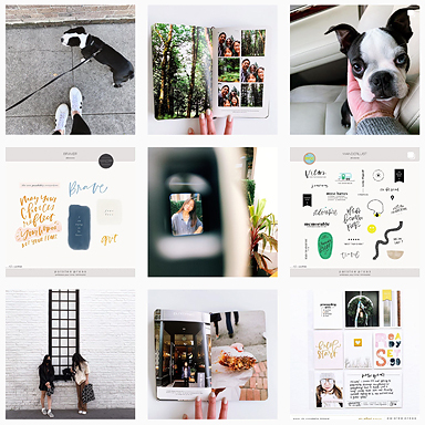
Hello there! I am Kristi Prokopiak, one of the latest additions to the Paislee Press Creative Team. I live in Brooklyn, NY with my hairless terrier Chloe. My day job is at a high end residential Interior Design firm, and at night I generally like to make stuff. I am not familiar with all things digital in the world of crafting, so I am what you would call a Hybrid Artist in scrapbook language. I’ve been documenting life for about eight years now, and it seems this is a habit that is going to stick!
Today I will show you what it means to be a Hybrid Artist and how easy digital can be, whether for traditional scrapbooks, Project Life or any other craft project.
This page is a great example of how easy it is to start. I opened the patterned paper file in Photoshop, printed it on to an 8.5×11 paper, and there you have it. Turning something you see on your screen into something you can hold in your hands is all it really is. No fancy actions or layers, just some fun new paper. I adore Liz’s designs, and love the fact that I can print them out on whatever I want. As simple as that, I’ve created a new patterned paper. This file was actually intended to be a white paper, but I printed it on one of my favorite pieces of cardstock and have a variation on the original.


(Hey There Handsome and Woodgrain Journaling Cards used on this page)
Above is a detail shot of my journaling, printed on masking tape and adhered to the layout. That’s a hybrid move, right there!
Another favorite thing to do is print on unusual items. Wallpaper, old magazine pages, wrapping paper… anything that can run through the printer can be a journaling card, paper or embellishment. I have a ton of watercolor scraps left over from school, and now I just print out whatever journaling card I want on them for a completely customized look. This page is mounted on a subway schedule for the L train, the one that my boyfriend and I use to travel from Brooklyn to Manhattan. It was a little overpowering as is, so I threw a piece of vellum on top to soften the look and let the top layer be a bit more prominent.


(Hey There Handsome used above.)
Lastly, anything you can print, you can also alter. I had the alphabet card printed out on a piece of graph paper and really wanted to use it on this page, but it was overpowering all the photos. I sanded the letters a bit, painted it aqua and then layered some vellum pieces on top again, to soften the look. Putting the number stickers on the outside of the protector ads some dimension, and some veneer pieces are always a fun moment.
I also love using digital “emo pins” (what we used to call 1″ buttons when I was younger, which is like, over a decade ago) as tabs on my paper layouts. I hate using these flair items on my projects because they create lumps and warp my pages over time, but as a digital element I can print out the image and still get the cuteness factor without bumpy page protectors or smooshed photos.


(Hey There Handsome and Press Cards No. 23 used above)
So as you can see, you can play, experiment and alter to your heart’s content. With digital products, there is no fear of “messing up” because you can always print more. I really stretch my “stash” this way, because the same card can be printed on limitless configurations of paper and ink choices. Considering these new goodies are stored on my computer, I say it’s a win/win. Especially in my cramped Brooklyn apartment!!
Thanks so much for following along today!
xo,k
pinterest I instagram I twitter I tumblr I blog
You can find all of my hybrid project posts here.


Really cool post, Kristi. The journaling on masking tape? Wow – stunning. Thank you for sharing!
Really love your work, it’s so original! <3
Totally excited to see you on a DT again Kristi! And as ever, you’ve brought some really fresh ideas to the table. Yayness!!
I Love your work! You took me back to my art school days many moons ago. Look forward to seeing more of your unique pages.
You are seriously all kinds of awesome Kristi! What you do with hybrid is so inspiring. I am so excited to have you on the team!
Great post Kristi! Can’t wait to see more of your work, which is truly original.
Love your work. Thanks for the reminder to use vellum as a way to tone down strong elements. Looking forward to more of your inspiration.
This is fab!!! Love the flair button idea especially. I really dislike bumpy pages too.
Wow, what great pages! This definitely makes me want to break out some of the old art supplies and work on a hybrid project.