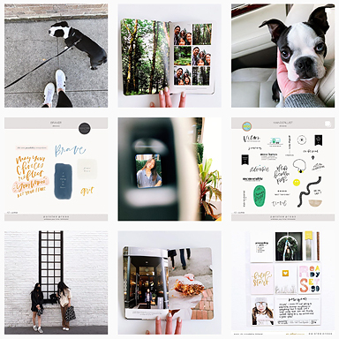
This is week 8. It’s one of those entries that I started and then abandoned because of clashing colors/looking way too busy/etc. – I didn’t like the way it was coming together but I didn’t know how to fix it. I revisited it over the weekend and am happy to say that I was finally able to finish it. Just for fun, this is the “before” page.
Too many “busy” photos, too many colors competing for attention, at least for my liking. I like my pages to have a sense of cohesiveness, and when I’m working on spreads like these that showcase different events throughout the week, creating color consistency is the easiest way to achieve it.
This is the “after“.
Swapping out some of the busy people shots with still life photos helped to bring a better balance to this page. When I’m working on the page design I use certain pockets as resting spots. Like commas in a sentence, they provide a natural break in the layout where you can pause and take things in before moving on to the next thought. The week in review journaling card and the rubber stamps photo were the “commas” on this page.
Also, pairing photos of different scale (close up of bookshelf vs. panned out shot of Madeline in the crowd) helps to keep the eye moving along the page.
I ended up moving this photo to it’s own space on an 8.5×11 insert. I think it shows better against the neutral kraft background.
The other side holds a drawing by Audrey.
This is what the completed week looks like.
The left side was a fun page to put together. All the photos here were from one day. To achieve color consistency here I converted 3 of the photos to black and white.
And lastly, one journaling card insert on this page, a list of things Madeline said this week.
……….
Project Life is a memory keeping system created by Becky Higgins. Read more about it HERE. All of my project life entries can be found HERE. All photos edited using RadLab by Get Totally Rad!


serious love her liz!! i love it when you post:)
eek…i meant serious love “here”! ha…i can really spell:)
Lol. Thanks so much Michele!!
I love your work and get what you are saying about pages being too busy. Always a problem for me. I have been looking to your work for inspiration and trying to be more minimal… easier said than done:)
Do you like photos in other hues/tints? Sometimes, A sepia tone can calm down all the colors. It might be a nice change??
I love your site and blog! And I am seriously contemplating sending you my life’s photos in stock and say…make pretty! I admire your talent and energy hope it can in spire me to do the same.
South African Love
Liz Watts
Loved this post Liz – thanks for sharing your creative talent with us!
Ronnie xo
p.s. Always look forward to your posts…