I’m back to share the amazing pages that our creative teams made using Curated.
These pages were created as stand alone pages, but they can easily be turned into a 2 page spread (more about this in part II of this post).
embellish
The clean and barely there quick pages from my minimalist collection are designed so you can easily customize and add your own personal flair to them. I love the way our creative team members took these pages and made it their own.
The same can be done to the eclectic quick pages from Danielle’s kitschy collection
photos + patterns
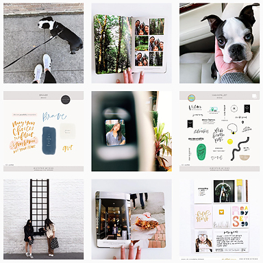
If you’re a minimalist at heart, you can do follow creative team member Desiree’s lead: keep the focus on the photos and use patterned papers to add texture and interest to the page
Love this series of pages by Desiree. Even though the subject matters are different, the pages look cohesive because all of her photos have a similar retro-vintage wash to it. I also love how she used a combination of photos and patterned papers to fill in the photo frames. And lastly, I have to point out that her use of embellishments makes my minimalist heart sing – a faint ink brush off to the corner, a little sprinkling of rhinestones over the corner of a photo – all of these little details are so subtle yet make such a powerful impact on the overall design of the page.
photos + words
Or you can go even simpler and just keep the focus of the pages on the photo and stick to the basics: photos + words.I love this series pages by Dunia. She made a page for each of her kids and was able to easily complete her layout by simply adding wordart sentiments from my Presslines collection.
More baby lovely pages


