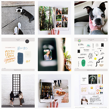
Update on the blurb book project: as of today, I have 87 pages done!!! Here are a few of them:


I honestly don’t know how I’ve kept the momentum going on this project. I really really really really really want to see these photos printed in a bound book. 🙂 This whole process isn’t happening fast enough.
I think I’ve finally reached the halfway mark for this project – at least that’s what I’m telling myself so I don’t get discouraged. 🙂 I have about 16 more days of photos to get into the book, then I’ve got to proof everything, maybe tweak a few pages (the ones that don’t look right side by side), mull over the photos (in the hopes that seeing them in this format will trigger more ideas for journaling), then do one final proof and then off to press it goes!!
I encountered a little hiccup a few days ago: I got stuck on a layout. There were multiple factors working against me. First, it was a multi-photo layout – those are always a bit more challenging for me. And second, I think I was getting design fatigue (there has to be an actual term for this syndrome? but since I don’t know what it is, I’m calling it design fatigue). I can only do the same look, apply the same design techniques so many times before I get bored. Here’s how it went down:
i liked that i was able to squeeze in 6 photos and still have lots of white space but the two photos in the middle were throwing me off and I really wanted to just focus on maddie’s happy+smiley expressions.
i took out the two photos and arranged the remaining ones in sequential order, going down vertically. not particularly crazy about this. photos are too big? too centered? too vertical? i couldn’t (still can’t) put my finger on why this feels off so I dumped this one too.

take #3
a different take. a closer crop. and different take on repeating a series of photos. it’s the same photo sequence but I varied it in each row to break up the monotony of repetition. design fatigue has fully set in at this point. now i’m overthinking everything and nothing looks good. at this point I should have walked away but i didn’t

take #4
i went back to the vertical design. except this time, i repeated the photo sequence three times and made the block smaller. more breathing room. aaaah. i moved on to tackle the text work. something still feels off to me. it’s too centered? boring? yes and yes. I changed the color of “happy” to a green color. now it’s duotoned and boring. still too centered and still very predictable. ack!!

For now, I’ve settled on take #4 one. I had to force myself to walk away from this layout and move on to other pages. There’s no faster way to lose momentum than to be stuck and obesessing over one silly little page right?
Anyways, I was browsing the galleries and noticed that Desiree had gone through a similar struggle with a layout she recently posted. I was intrigued and totally curious to see what her other takes looked like so I emailed her and asked if she wouldn’t mind sharing her scrapping process here and she said yes! I’ll be back later tonight (or tomorrow) to share Desiree’s makings of a layout write-up.
Before I sign off to get more pages completed, I just wanted to thank you guys for all of your encouragement and for rooting me on – it’s really helping to keep my momentum going and I am ever so grateful to you guys for it!! I also want to take this time to respond to some of your comments.
Joanna – I love that you interview your kids with the same 20 questions. And that you include the little things they’ve said throughout the year. That is such an ingenious idea! Would you mind sharing how you are able to maintain these lists (mulitple ones at that!!)? Keeping track of the things my daughters say and do is a big challenge for me. I’m all over the place with it. In addition to keeping notes on a private blog, I also write things on calendars, in the little notebook I carry around, and occasionally on my google calendar. Oh, and I also jot down notes when I post photos on flickr. whew!! I need a lot of help and guidance in this area so I would love to hear how you’ve made this a manageable task!
I was wondering if you would consider placing your blurb templates for the entire album into your oscraps shop? It would sure help the rest of us non-designers to finally put together an entire huge book that is so streamlined and beautiful. Just a thought. I’ll keep my fingers crossed. :o) – stacey m
Stacey M – This is definitely something I’m considering. It will all depend on how the final printed book looks. If I’m happy with the results I will definitely make them available in my shop, thanks for suggesting it!
……….
I scrap out of order as well Stacey! But I don’t print them out as I get them done. That’s a great idea and you’re so much more ahead of the game than I am! When I sit down to scrap, I reach for photos that inspire me at the moment, so there is no rhyme or reason to the pages that I have completed. So I’m doing this blurb book so that I have a book that contains all (well almost all – I’m leaving out the blurry ones) of the photos arranged in themed/chronological order. For example, the current book focuses on Maddie/the first 60 days. I also plan on doing books for Audrey’s first year and also want to do a book of our 2006 Europe trip, our honeymoon, and the list goes on. 🙂 In addition to these chronological books, I will probably do mini themed books like “favorite moments of 2009” or “first family vacation”. Those are always so fun to do! You can see the ones I’ve done in the past here or see the links under the PROJECT section on my sidebar.
have a wonderful wednesday and thanks for stopping by.
🙂


Your progress has inspired me but also caused a conundrum! The last few weeks I've tried fitting all four years of college in one scrapbook, and I've been making progress, but I love the look of what you are doing, I think I can put more photos and have more pages with those sorts of layouts. So now I don't know what to do! Decisions, decision.
More stunning gorgeousness, Liz!!! I have a question… what font are you using? Thanks to you, I've been busy using the many quickpage books I've accumulated but never actually finished! Thanks for the inspiration!
This book will be such a keepsake! Remember, in 15 years when you're looking through it, you probably won't even remember which pages you struggled over; it's the photos, stories, and memories that count, right?!
I think the problem with #2 is that the long edge of the collage is parallel to the long edge of the page (it's the same thing on #4, but that collage has a wider width, so it's a more balanced). I actually liked the #1 layout the best…if those middle photos were bothering you why not just swap them out?
I think you're making phenomenal progress! I just bought one of your quick albums (for my daughter's first 6 months) and it took me HOURS (like, 5 or 6, over two days) and all I had to do was choose photos, not create the layouts. I should be getting it soon…can't wait to see the results!!
In Awe. . I Love Love Love The Park Page.
i am SOOOOOO in love witht his book Liz, you just inspired me to have my camera fixed soon so I can take pictures and scrap again! Ive been shooting with a blurry viewfinder. I cant determine if im focusing right. YOu go Liz!!!!
I read in your blog that you were struggling with the "lists of what Audrey sais and does (and, in about a year, that will also go for Madeline)…
Shall I tell you what I use? Maybe it will give you an idea? Or inspiration?
I just 'simplify'. I carry one (small) notebook with me, especially for those funny comments and things my daughter does. There is no other place where I write or type down those things. Just that one book. That really helps chaotic little me. When I'm done with my LO (incorporating the things I've written down), and therefore have a "final" version, I just rip out that page(s) of the notebook. That way the notebook also stays "noncluttered".
This really sounds a bit neurotic, right? 😉 Hehe. It does help me though…
Ayesha (aka Esk)
Beautiful pictures!!
LOVE it! I just ordered my first blurb book to see the quality. It was only 20 pages, but WOW! The binding is stiched which means it will last a lot longer than books from Shutterfly, etc. I ordered the photo wrap cover and wasn't sure if I would like the matte finish… but I love it! One question for you — are you saving your photoshop files as JPEG or PDF? I saved mine as JPEG and the quality of the text wasn't the best. Perhaps PDF would be better?
It's gonna be an incredible keepsake. I am loving, LOVING the pages!!
this is so nice. you're giving me a great inspiration/idea on how to tackle with so-many-photos-to-scrap issue. hehehe…
thank you so much.
hi liz, i'm not exactly a scrapper. Although, I enjoy looking at the LO's and stuff that other people come up with. But, I particularly love yours as your designs suit me. I wish I can scrap like you do; having that artistic and creative mind. Even if I did try, I'd have a long way to go, no doubt.
Also, just want to say that I too have been toying with the idea of having a photobook done up for my girls. And I am glad I stumbled upon your post recently. It simply gave me the inspiration and the determinatioin to go through with it. Not that i can do it as lovely as you've done. But I guess I have to start somewhere and I hope, with time, I can only get better.
Thanks for sharing your ideas and your creativity with us.
Liz, your book is a work of art, I'm speechless! Truly beautiful- minimalism at it's very finest. 🙂