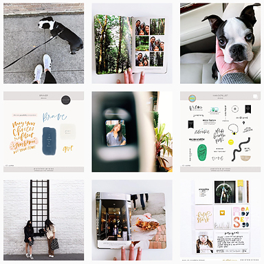
Hey, it’s Caylee, and I’m sharing another week of my Project Life with you.
You know how last time I had too many things that I wanted to document ? Yeah. This time I have too few. Since I’m not too great on filler cards, I decided that I’d skip my traditional format, and use this spread in a different way to the rest of my year. I dedicated one side to my husband and the other side to me, and made a he / she layout.

Left side:

Right side:

Dates covered: 28 October – 3 November
Location: four photos from Crete, and two from Bruchsal, Germany


Favourite moments: I really like the he / she format of writing. I kept it factual this week, but I think as I get more into it I’ll branch into something deeper. I went full-cheesy and did pink for me, blue for my husband. My husband’s side wasn’t completely masculine, though, with all the flowers. I guess it’s still obvious that I’m the one who created this layout.

Anything special: getting my watercolour writing into PL,

I love incorporating paper from a kit as a clipping mask over an element. It really brings everything together.

Kit used: We Were Here papers and elements, He & She
It’s always fun to break away from what we’re used to and do something different. It keeps things interesting. Happy November.
– Caylee
You can find more bits of my life on Instagram, Twitter, Pinterest, and my blog.


[…] Go say hi on the paislee press blog. […]
These two different spreads look great! Awesome watercolor writing! :O
Looks just perfect, Caylee.
Ronnie xo
This is a gorgeous layout! Can you talk a bit more about how you re-coloured the He & She stamps please? I didn’t understand that part. Did you just take the paper and clip it to the .png file? Also, what is watercolour writing? Thanks so much!
Hi Melanie
The watercolour writing is just writing with a paintbrush and watercolours.
To recolour the He and She, I used a clipping mask in Photoshop. Liz has a tutorial here: http://paisleepress.com/2009/01/layered-templates-101/
This YouTube video shows you how to do it – http://www.youtube.com/watch?v=o_ApZFj0RAE. The Text would be the .png file and the flag would be the digital paper.
Hope this helps.
Caylee
I’m sorry, I completely misunderstood the products you used! I was wondering how you were able to change the background of the He & She, yet still retain the writing, because I thought they were in the same file! Now I understand that they are two different files, the circle tag (which you clipped the paper to) & the stamp on top of that. It’s not as difficult as I thought it was!
Thank you so much for your time!
Seriously seriously in looooove. I’m trying to get a bit more adventurous with my “artsy” side. I adore the watercolor elements, the white space, the pink and blue… beautiful and so inspiring, Caylee. xo, Catherine
Thank you, lovely Catherine.
[…] Go say hi on the paislee press blog. […]
Superb Blog!|
These are truly fantastic ideas in about blogging. You have touched some fastidious factors here.
szablony www
[…] you are forcing it. Caylee has made some beautiful full 2 page spreads out of just a few photos, like this one, and I plan on doing that : when I have a good plan for it. Besides, if I could get a whole year […]
[…] His & Hers pages by Caylee […]