Welcome to another blueprints: conversations in album design post. Today I have a new album to share with you! After all these years of scrapbooking, I finally got my eclectic collection of layouts printed in an album. You know what had me stumped for the longest time?
The mish mosh eclectic-ness of my pages.
I think most of us are in this mish mosh boat together? We don’t scrapbook chronologically, we don’t use the same kits over and over again, and to make things extra mish-moshy, we also like to experiment with different styles and try new artistic techniques. Hence, we end up with a collection of great pages that don’t necessarily match.
And I rather like it that way. I like being able to treat each new layout I start as an individual art project. I don’t want to worry about how it will coordinate with the last layout I made and how it will look in a book. If I get caught up in those details, it would take all the fun out of scrapbooking (you know, the creative freedom part) and I’d probably never get any pages done.
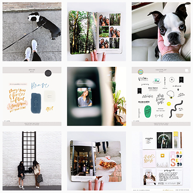
What I don’t like is the daunting task of organizing this eclectic-ness. So I put it off and put it off and then put it off some more. Then one day, I was staring at the photo collage on my wall:
 and thought, gee, I kinda like the way the layouts look next to photos. Then it occurred to me, why not use the layout + photo format to make the album?
Dude.
The answer was right in front of my face the whole time!
album info
7×7 blurb book, image wrap
First, the layout + photo formula allows me to treat the layout as I had scrapped it – as an individual art piece. All I had to do was find a photo that coordinate with the page and I was done with that 2-page spread.
Second, since I do mostly one photo layouts, this formula gives me a chance to add more photos to fill out the story.

We took this series of self portraits in the layout above while were waiting for Jack Johnson to come on stage. Now the story seems complete paired with the photo of the stage at the Outside Lands festival concert.
And lastly, the layout + photo formula is easy to execute. Just pair your layout (that you’ve already scrapped) with a photo. If you are super organized, you can put together your album in a matter of hours.
This project actually took me three days to complete. Most of the time was spent on photos – editing photos and hunting down photos to coordinate with the layout. I didn’t include the date in some of my layouts (epic fail!) so I spent a lot of time trying to figure out which day a particular photo was taken. Epic fail, but a good lesson learned. I will be much more cognizant about dates. I also revised/updated some of the layouts (changing colors, etc.).
Next time I will talk more about the little details that give your album the extra special personalized WOW factor.
As always, Audrey and I welcome your questions and comments via our Formspring accounts or the comments section of our blogs:


I've never printed a single one of my scrapbook pages because I was scared of how they would look in an album. This takes out all of the guess work! It flows so nicely together!
I love this album 🙂
that is so incredibly awesome! 🙂 I really, really should print my stuff…
This is a genius idea for doing a bound photo book without worrying that the facing pages won't "go together"! This will make for great gifts for family also. Thanks for sharing your creative genius Liz!!
This is what I've thought of doing too for my pages. All mine are so different from each other and since I love to focus on photos anyway I thought when I was ready to print them I'd do it like this.
Love how yours turned out Liz!
So very very inspiring! I think I might have to translate this into traditional scrapping.. love this so much, you are so crazy talented!! Pure genius!!!
Super great idea! Many of my pages have been designed to be completely digital (for consumption by long distance family) but now I have a logical and elegant way of putting all of this together in a book to complete my storytelling. Thank you for sharing this marvelous discovery of yours!
This is a great idea! I mix digital with paper pages and follow Stacy Julian's Library of Memories system, so I print all my digital layouts (most at 12×12 size, some 8.5×11 and a few 8×8) and put them in page protectors in 3-ring albums. However, if I ever wanted to print digital pages for a gift, this would be a great format!
I absolutely love that idea of one side photo and one side layout. The finished look is so polished and you get a chance to use those photos you love but maybe didn't get to scrap. thanks so much for sharing 🙂
on a side note…i see you got your book in a 7×7 and I'm wondering how you like that size? Since I started creating in 12×12 I've been printing in 12×12 and I'm too chicken to try it smaller. I think it would be easier to handle especially when the kids want to peruse their photos and it would be cheaper. Do you recommend the smaller sizes?
you are brilliant, liz.
HI Liz, I just see your blurb book, One again, waououuuuuwwwww, really great ! I love Love Love everything you do. You're such talented !
You're right, till now, I never printed my layout. I have to do it, you give me the envy to do it !
Fredo
Wow, thank you guys for stopping by and for taking the time to leave such incredible comments.
@maria – I have albums printed in all sizes, 12×12, 8×8, 8×10, 4×4, 5×7, and now 7×7. I do prefer the mid range size (8×8 and 8×10) the best. Easy to handle and easy to store, yet doesn't "feel" small.
The 7×7 blurb book is a bit on the small side, and will probably be a shocker for you if you are jumping from 12×12, but once you get used to it, I think you'll love it. My idea would be if blurb made an 8×8 option. 🙂
Love love love this idea! Especially for my ecclectic, They don't fit anywhere pages.
Brilliant idea Liz!! I rarely print in hardcover books, but may have to give this a try for a gift album.
Genius!!! I absolutely adore this idea – Thanks so much for this post!!
Liz, you are brilliant!! This is such a great and simple idea. 🙂 Congratulations on the book…isn't it great to have a printed book to flip through?
This is just how I want to do photo books. I have been trying to find a style that I like, and here it is! Your book is just beautiful. Liz, is the photo page a Blurb template? Is Blurb user friendly for uploading finished layouts?
Thanks for sharing Liz!!!!
I've had a photo book on hold for a year now…it was supposed to be my son's graduation gift….and it just didn't look right. YOU are a superstar in my heart….I am going to finish it this week with your strategy on making layouts flow within the book!!!!! YIPPPEEEE! xooxox sue
What a fabulous idea! I love it. I just paged through your book … what an absolute treasure.
I've just been thinking about a theme album I wanted to make … I think I may use your ideas! Thanks for all your wonderful inspiration
ooh, this is a pretty revolutionary idea to me–I feel like I did when I read Lisa McGarvey once say she puts all sizes of layouts in one 12 x 12 album–of course! How brilliant!
很用心的blog,推推哦 ........................................
Fantastic solution to the "matching sides" problem. This is something I struggle with when paper scrapping as well, and I may try this solution for a few traditional albums as well. Just print a large photo for the other side!
beautiful family, and a great book. thanks for the tutorial.
Love the look of this! I mix mine (traditional, hybrid, digi and photos) into binder style albums. Haven't tried printing a book, but now I'm feeling more inspired to give it a try. tfs! 🙂
You are genius, my friend, but you know I already think that. I was just thinking, as a spinoff from Elizabeth's comment, that traditional scrappers could do something very similar, except they could use some of the divided page protectors to include additional photos that they didn't scrap but still want to include to finish out the story.
you know…i still haven't scrapped my photos from the jack johnson concert we went to back in…um…a long time ago lol – LOVE this idea! 🙂 thanks for pointing it out for me 😀
Great idea you have shared here – plus all the extra inspiration from all of these comments! I will definitely be incorporating this idea into my scrapping.
I LOVE your album! This is the best idea!! I am not a huge fan of scrapbook pages that have a lot of white space and tiny photos. They look nice and artsy, but well… I want to see big pictures. This solves that issue and looks awesome!
gee-nyus!!!
this is one of the most beautiful photobook i´ve ever seen. i want to do one myself now. ***lovely!*** thanks for sharing!!! you´ve got an amazing blog!
GENIUS!! WOW.. I luv LOVE what that added photo does for the "Story" of your lo's. What an awesome album!!!!
GIRL get OUT! this thing turned out SO AMAAAAZING!!! wwwwwow!! i feel so inspired!!!
Nice … no, actually WOW.
Love it.
I'm curious if you tried pdfs this time, and if your text came out clearer this time.
This is brilliant … thank you for sharing this idea.
This is genius! I love it!
@marty – blurb is very user friendly! regarding the design of the photo pages – I did those in photoshop – it's easier for me to make the page that way. I like having full design control. You can use the blurb templates/layouts to design your photo page – use whatever you feel will work best for you. 🙂
@carolynvw – I uploaded them as jpegs and the text printed out just fine. 🙂
Omgawd, Liz… you're a frakkin genius. If I could hug you right now, you would be squeezed. {voodoo_bryn}
I think all your pages go nicely together anyway!! But this is a fantastic idea.
I print my pages out 12 x 12 religiously and it just costs a bundle of money 🙁 Printing them in a book like this would be heaps cheaper. But how do I live with the fact that I've got 9 other albums that are mish-mashed in binder albums???
Ohhh my GOSH!! I totally love what you did, and it never occured to me, that this was an opportunity.. I definitely need to look at my pages now, and finally get some layouts printed!
I've never had my layouts printed into a book myself, because I don't scrap chronologically. OMG your idea is brilliant! Am bookmarking your entry, thank you so much for the amazing inspiration! 🙂
This is brilliantanda stunning! thank you for sharing this idea and the inspiration.
=)
Wow Liz! I love how this turned out!!! Great idea!!! Thanks for sharing it with us!
Hugs!
Soco
What a great idea, Liz! I love the way you album looks! Your photos are spectacular! Love it!
Thank you so much for this fabulous and inspiring idea! You ladies rock!
Wow, Liz! That is genius! I love it! Thank you for this wonderful idea!
ummm DUDE that is awesome! 🙂
I never thought to do that!
ummm DUDE that is awesome! 🙂
I never thought to do that!
Your book is fabulous!!!
Your book is fabulous!!!
You are a genius! I love this idea and can't wait to try it.
You are a genius! I love this idea and can't wait to try it.
Great thoughts! Thanks for sharing your ideas with us. It gives us the courage to actually put our work in print! Thanks for helping us see another option to printing our mish mash pages. Awesome job well done.
Great thoughts! Thanks for sharing your ideas with us. It gives us the courage to actually put our work in print! Thanks for helping us see another option to printing our mish mash pages. Awesome job well done.
What a beautiful concept! Love the idea. Thanks for sharing 🙂
Wow! What a fantastic idea!! I completely agree about not wanting two non-coordinating layouts side by side. I love this idea!
I am glad I stopped by again after awhile away. Your ideas are so inspiring. I love this! Thank you for the big tip!
Great idea, I'd really like to do this. THANKS!
[…] album and have a hodge podge of un-coordinated pages? Why not try Liz Tamanaha’s deliciously simple solution: put a full size image on the facing page. I used this technique in Emily’s first year […]
[…] I have refined my workflow process, which is loosely based on an idea Paislee Press blogged about here … she has a layout on one side of the page in her Blurb book and then features a full-page […]
Love, love, love this idea!